
Memo by NHArchitecture comments on environmental issues and gives a critique of the icon.
The curatorial concept, advertisements for architecture, was a good idea that found some wildly uneven expressions. Spurred on by an ostensible historical event (the downturn in the building industry as the global financial engine ground its cogs to slow motion), the curators invited practitioners of all kinds to reflect on architecture. In the theory and history trade this is also known as the recurrent identity question: what is architecture? In an era when some architects have become brands or signature names aligned with luxury fashion “houses” (complex, diversified corporations) and some buildings have become “destinations” – high-profile products of the culture industry – the proposition already has a complex recent history. Architecture and advertising are two categories already heavily contaminated with each other. But the curatorial project was much closer to the early career moves of a famous architect interviewed and included in the catalogue. In Bernard Tschumi’s words, he aimed to trigger a “desire for architecture.”

A Vision for Tomorrow by Adrian Lo.
Asking for responses to be couched as advertisements for architecture, the curatorial brief oscillated between the liberationist philosophy of thinking beyond the building and a rather old-fashioned definition of advertising as communication. Tschumi’s interest in desire says rather a lot about the way in which many advertisements do not communicate but very effectively associate. Fashion, jewellery, perfume, shoes, furniture, some vehicles and sex services fall within this domain. Promotions of these products are not maps or explanations but constellations of image and text that create links often conceptually incoherent but emotionally affective. It was a hard brief to dance to the demands of both concept and affect. Not surprisingly, the architectural advertisements were accompanied by long explanations of the positions entailed in the images.
Presumably the constraints of time and finance determined the familiarity of the format: text and image transferable to poster, page or website. Advertisements have escaped their traditional boundaries and pervade our necklines, chests, bags, pavements, skies, wall surfaces and light poles and, without invitation, interrupt our internet browsing. Perhaps that’s why I was attracted to some of the entries that took familiar surfaces and the ways of inscribing text upon them as sites for re-inscription.

Mitchell Hill’s Cool Kids reinforces the everyday nature of architecture.

Everyday Matters by Sarah Ash and Kyra Thomas defamiliarizes the everyday with a “gloriously over-invested” garden shed.
Mitchell Hill’s Cool Kids depicted a stolid, shiny refrigerator lodged like a sentinel in the corner of a kitchen. Four wonky lines of text composed from the plastic, magnetic letters we use to transform the surface of a fridge into an educational space for children spelt out the message: “Architecture. There’s a little bit in all of us.” Accompanied by a hand-drawn children’s iconic house, this piece nicely reinforced the everyday presence of architecture. At quite a different scale, NHArchitecture’s Memo gave us a Google Earth perspective on a browned landscape abutting a city’s suburban edge. A giant message was clearly spelt out from individual “letters” rather than identical text. Each letter was formed from the plan view of a building’s roof. A kind of car park of parked buildings wrote the text “Architecture Beyond the Object”. This image/text work resonates very strongly through various registers, from the critique of the icon to the environmental issues imprinted in the bisected landscape of suburban expansion and parched ground. Both these entries took familiar modes of information and rewrote them. Conceptual sophistication was matched by visual innovation.
These two entries of course also negotiated the conventional codes of architectural representation: the repetition of certain ways of seeing. If these two entries refused the facade view of buildings (or straitjacket tidy interiors) so familiar from architectural photography, and so intertwined with the hero shots of iconic buildings, one entry cannily re-figured the mysterious and glossy architectural surface. Sarah Ash and Kyra Thomas presented a work titled Everyday Matters. A black, minimalist building at the scale of a garden shed but gloriously over-invested as a piece of sumptuous design had casually strewn children’s outdoor toys cosy up to its unmarked wall. In white text over the top of the small building, the authors proclaimed: “Architecture matters every day for every one.” Investigating architecture as a form of thinking, a way of seeing the relations between space, all kinds of buildings and inhabitation in its many modes, the piece was short on words and long on ideas. I found the work a very effective challenge to the blind spots of our architectural discourse and image culture, transfixed as they often are by “the avant-garde and iconic structures”, to quote the architects’ caption. The authors surely understood that their substitution of glossy pavilion for backyard shed de-familiarizes the everyday (in that old avant-garde gesture) and inverts but does not quite reject the terms under critique.

Rebecca Daff’s Your Architect.
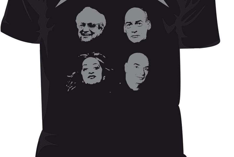
These three images were the standouts for me. More familiar targets surfaced in the sights of other exhibitors. Some were well skewered, as Marcus White transformed the gang of four (Zaha, Frank, Rem and Jean) from stereotypical architects (elite, northerners) into heavy metal rock gods. It was a successful one-liner, played out in one of the most predominant modes of advertising: T-shirts with offensive messages. Other entries relied on the staple clichés of architectural bad guys (developers and the suburbs). These depictions would have benefited from a broader understanding of the varied instances of these architectural situations (hardly conducive, however, to transforming a longwinded explanation into a familiar polemic). Therein lies the difference between academia and Mad Men.
Most entrants stuck obediently to their advertising brief. Surprisingly few exhibitors were tempted to transform the curatorial project into an architectural proposal. The POST-Fab 3.0 (a software application?) risked this desire, proposing a protected haven for endangered modernist buildings. I’m presuming this was a satire on the heritage industry, theme parks and the icon industry, but the work walked a fine line in earnest tone and rational irrationality.
It feels a little awkward to assess the pieces by conventional critical means (explanation, interrogation and judgment). Advertising is a cruelly ephemeral medium and subject to constant renewal in the face of consumer fatigue and new product lines. I may have found much of the content of the exhibition overly familiar but the products were aimed partly at those on the outside, a different market. I do think the idea is worth revisiting every couple of years, at the very least as a barometer of the many architectures that jostle for space in that category we conventionally call “Architecture.”
Source
Discussion
Published online: 1 Feb 2012
Words:
Dr Karen Burns
Issue
Architecture Australia, January 2010