UTS Broadway
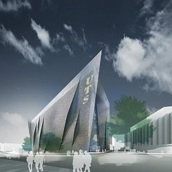
Winning entry by Denton Corker Marshall.
Laura Harding reviews the recent competition for the new building for the UTS Faculty of Engineering and Information Technology.
Sydney can be a vicious place to practise. Consider Sam Marshall – a highly skilled and determined small practitioner snares a commission for a $50 million addition to the Museum of Contemporary Art, only to wake the following morning to find a leading Sydney architect decrying it as “an obvious box” on the pages of the city’s premier broadsheet. The announcement of any public commission or competition in this city will draw out carping, public criticism of this kind. Unsurprisingly, the recent competition for UTS Broadway was no exception.
The outrage erupted as soon as the short list was announced – in fact, before any of the short-listed submissions had been released publicly. Attention was fixed on the make-up of the short list and its preponderance of large practices: Francis-Jones Morehen Thorp (FJMT), Cox Richardson Architects & Planners (Cox), BVN Architecture, Bates Smart Architects, and Lacoste + Stevenson Architects/Six Degrees in association with Daryl Jackson Robin Dyke. Complaint seemed to rest on the curious assumption that large practices consist entirely of people aged over fifty-five and are inherently programmed to produce work that is banal and/or retrograde.
The briefing documents for UTS Broadway included a few dog whistles that were accurately interpreted by those attuned to their pitch. Stage 1 asked for an optional “expression of concepts” and a mandatory “statement of capabilities”. This was shrewdly interpreted by Lacoste + Stevenson/Six Degrees as a recommendation to team up with a big player – it was optimistically interpreted by numerous other small practices as an indication to lavish time and money on highly detailed conceptual presentations that might sneak through to Stage 2 on design merit.
Conceptually, the brief was typically sparse. Proponents were asked to provide a new building for the UTS Faculty of Engineering and Information Technology. The site is a dramatic urban corner on Wattle Street and Broadway, opposite the Carlton United Brewery redevelopment site and close to Michael Dysart’s brutalist tower, a much maligned university landmark. The brief called for creative interpretation of the campus masterplan, facilitating a number of pedestrian desire lines through and around the site as well as multiple connections with UTS Building 10, which occupies the northern boundary of the competition site.
Functionally, the brief prioritized the accommodation of 600 PhD students as the “physical and conceptual centre of the building”. A series of collaborative laboratories were indicated as the space for academics, industry and students to come together in flexible workspaces that could accommodate multiple research agendas. A data arena, read glorified lecture space, was identified as the primary public space of the project, and there was a desire for street activation and transparency of activities in the building. Interestingly, in Stage 2 this programmatic specificity was tempered by the requirement for any space in the building that was not a lecture theatre or research laboratory to be flexible and accommodate interchangeable uses. The teams positioned themselves distinctively between this programmatic specificity and flexibility.
Bates Smart drew upon their commercial savvy to propose the most adaptable and resolved floor plate of the entries – an infinitely flexible space of large dimensions, with cores located in opposing corners and public circulation that eroded the edges of a Perraultesque environmental facade.
FJMT, BVN and Cox traded efficiencies in the floor plate to maximize opportunities for articulation of the project’s urban form. BVN split the proposal longitudinally, with a linear atrium and core that formed the public circulation and four distinctively proportioned parts of the floor plate. Public areas at ground level were sculpted in section to resolve the site’s levels and articulated by the triangulated substructure of the raked theatres above. This triangulated structure was employed to lesser effect on the building’s facades, where it formed a syphonic air cycling system, but the repeated use of this motif seemed unnecessarily limiting.
Cox broke the floor plate into a series of tower elements that rhythmically articulated the Broadway frontage, but they suffered from a rigid uniformity of proportion and scale, which reduced the scheme’s potential flexibility and responsiveness. FJMT employed a series of ribbons to fan open built form to the north-east campus green and articulate the Broadway frontage as a series of undulating bands, but did not employ the same largesse in the articulation of the project’s primary circulation spaces. These relied heavily on a tight, thin corridor, which limited the opportunities for informal gathering that the other diagrams afforded.
Lacoste + Stevenson, Six Degrees and DJRD alone opted for the expression of programmatic specificity, and in doing so proposed the most spatially distinctive of the proposals. Taking seriously the desire to locate the PhD students at the heart of the project, this proposal aggregated them into a honeycombed facade and fused them into the identifiable imagery of the project. Split from the main floor plate by a linear atrium/core, it alone offered a balance between independence and communality. (Communality being celebrated in theory, but privacy being relished in practice.) Topped with an evocative roof garden and layered with disarmingly low-tech environmental control, this proposal prioritized the experience of the building’s users to form a joyful suite of intimately scaled spaces.
Reading between the lines of the juror’s report, Denton Corker Marshall seems to have crossed the line first as the most visually arresting, singular urban object among the proposals. This characteristic could be catastrophically limiting for many practices, but one has confidence that Denton Corker Marshall will flesh out an intelligent body beneath the bling. Currently its floor plate lacks the finesse of its competitors’, but its inner workings are still subject to the input and scrutiny of the client group and, it could be argued, are appropriately loose at this stage. The skin of the building is a three-millimetre, laser-cut aluminium “veil” that uses binary code to translate and represent the building’s title. The risk in referencing such specific imagery is built-in obsolescence on a grand scale. However, Denton Corker Marshall has identified a desire on the part of the client group to “brand” the building, and one hopes that they will invest this element with more inherent architectural weight as it is developed.
The city’s cultural, political, educational and financial institutions are conservative and slow to change. Unfortunately, most of them are involved in the procurement of any major public or institutional project. The lack of opportunities for young practitioners and small practices in public work is a major concern, but the conservatism of institutions will not be transformed in a single competition. It will need to be nudged, slowly, over the course of many. We need to be looking at modes of constructive interaction between small and large practices in the procurement of these types of projects, instead of seeing them as the rightful preserve of any one group. Lacoste + Stevenson, Six Degrees and DJRD have led the way in this instance.
At this moment there is a more pressing agenda. The fight for a superior architectural outcome at UTS Broadway has not even begun. The proposal has an interminable number of committee reviews and cost cutting, contractual and procurement vagaries still to contend with, any of which are infinitely more hurtful to the production of public architecture than the competition process may or may not have been. We have our collective fingers crossed that Denton Corker Marshall can pull an architectural rabbit out of what we know to be a bureaucratic crown of thorns. Perhaps the Sydney architectural profession can be encouraged to line up publicly in support of Denton Corker Marshall in their impending undertaking – it would be a more significant contribution to the cause of public architecture than the unedifying spectacle of internecine angst that has marked the profession’s commentary on the competition to date.
Laura Harding practises with Sydney-based practice Hill Thalis Architecture + Urban Projects.
University of Melbourne
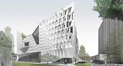
Winning entry by John Wardle Architects and Office dA.
Nigel Bertram reviews the recent competition for the new building for the University of Melbourne’s Faculty of Architecture, Building and Planning.
The present approach to the organization of activities within our university faculties and schools tends to want everything to be connected to everything else for maximum interdisciplinary potential, and for minimum separation based on the sometimes arbitrary distinction of functional type or discipline category. This drive towards a “horizontal” model combines with other factors to produce ever larger building units and deeper floor plates.1 Long-established economic imperatives such as the high cost of vertical transportation cores and of facade area versus building volume contribute, of course, to this gradual fattening of university buildings. However, perhaps most intertwined with the quest for organizational interconnection is the parallel demand for equality of access/mobility and a relative lack of absolute standards governing access to natural light and air when compared with other building types, such as residential or commercial office accommodation. Going outside or moving between different, smaller buildings as part of daily life in a city or campus context would seem to be unacceptable.
To accommodate the 18,000 square metres of floor space briefed for the University of Melbourne’s new Architecture, Building and Planning (ABP) building, a narrow tower – such as the nearby Redmond Barry or Raymond Priestley buildings – would be not only contentious but also organizationally unacceptable, producing what Shadrach Woods called “planes of isolation”. Candilis-Josic-Woods’ Free University, Berlin (1963–73) was a “web” of interconnected rooms/platforms, open courtyards and streets: a porous, two-level mat-building covering the site. The authors argued that “in a groundscraper organization greater possibilities of community and exchange are present”.2 The Free University’s aim to break down silos of insularity and shift the focus to smaller (project-focused) groups that are able to change composition easily over time is still highly relevant, and all six short-listed schemes in the ABP competition could be understood in terms of a thick, mat-type building.3 The difficulty is that the volume required on the site produces a six-level rather than a two-level building. At this scale, courtyards become atriums, and the contemporary university building approaches the form of a large department store or shopping centre.4 Denton Corker Marshall refers to warehouses as its starting point, but in the end proposes a centralized atrium building: an enormous black cube approximately 65 x 60 metres square in plan, covered with an “environmental veil” of pixel-like metal screens over all four facades and even the roof. The effect is curiously dark and moody (“a place of creativity within an aesthetic black box”), although raw surfaces within promise a tough and practical space. In its organizational structure, the scheme operates as an up-scaled and better resolved version of the existing ABP building.5 The veil-facades provide an image of porosity; however, any sense of real mat-like complexity in the internal organization is difficult to find.
McBride Charles Ryan named its proposal “the Sphere and the Labyrinth” and this reference is interpreted quite literally as a Boolean subtraction of solids, resulting in a giant, sculptural, concave surface facing south towards the main pedestrian thoroughfare from Swanston Street. The firm’s fascination with caves and other complex dark spaces is explored effusively in the interior, in a vocabulary of grottoes, cracks and crypt-like top-lit spaces, organized around a diagonal “canyon”, which doglegs through the volume. The potential claustrophobia of the deep plan (approximately 70 x 50 metres in this case) and shopping-centre-scale interior is not particularly resisted, and is heightened by distributing private academic offices around almost half the external perimeter on some levels. The basement is fittingly the most compelling level, with a stormwater reservoir and thermal-mass labyrinth made from the demolition rubble of the existing building, above which the new building rises on hexagonally arranged columns. From the presentation boards, however, the singularity of the inverse-spherical diagram dominates any sense of more subtle internal interconnectivities and more nuanced relationships, which would likely reside within.
Koning Eizenberg with William J. Mitchell and Gehry Technologies valiantly attempts to break the deep floor plate formula, slipping two parallel buildings apart and outside of the understood site area to reconfigure the campus east and west into two new courtyards. The effect of this misalignment, however, is to extend the visual presence of the new building as a backdrop to the campus, dominating all around it in the representations. In terms of achieving the desired horizontal interconnectivity, this scheme relies on notions of “transparency” and a “digital nervous system”. The modernist H-block parti makes it difficult to achieve any sense of mat-like internal organization, and the curious facade treatment of folded glass planes is both relentless and unexplained. Evidence of other university buildings suggests that the rendered literal (cf phenomenal) transparency would ultimately be difficult to achieve.
Sauerbruch Hutton with NHArchitecture proposes perhaps the most literally mat-like solution: a porous, square plan made up of four east–west slab buildings twelve metres wide with six-metre laneways/courtyards between them. These strip forms step up from east to west in section ranging from three to six levels, resulting in a well-scaled terraced rooftop landscape. Amoeba-shaped cores with attached shared program link the linear buildings and provide cross-circulation possibilities. The narrow floors with continuous openable windows provide a high degree of transparency and a sense of light and openness in the interior representations, but again it is not clear how this uniform literal transparency would translate to the messy realities of conflicting close neighbours, privacy screening, random blackout blinds for projection and the like. The building is uniform in both plan and section, with little exploration of the potential for variation in width or sectional height, which might have allowed for diagonal views and greater variety in occupation. Perhaps the consistent linear form is, in the end, too strong to achieve the ambiguous type of porosity required. The promise of indeterminate flexibility (i.e. anything is possible within a twelve-metre width) could become rigid and limiting.
By far the most radical proposal (in avant-garde terms) is the Diller Scofidio + Renfro/BVN Architecture scheme. In a type of homage to Claude Parent, a huge, oblique plane materialized as a giant staircase provides a dynamic organizing device and active public surface dividing a large singular volume. Dramatic cantilevered floor plates housing transparent studio and seminar spaces hover out almost unbelievably over this stepped plane, hung from three huge steel girder-trusses on the roof. These also act as a gantry crane, lifting building materials up to a rooftop open-air 1:1 building workshop, from which completed construction experiments are lowered down onto the unsuspecting Union Lawn. This is a fantastic idea, and conjures up heady associations of constructivist machines and Cedric Price factories, but the whole ensemble is so far off the scale and so reliant on exceptional technology (such as pleated structural glass) to achieve its effect that one has to have some doubts. The crane in itself is a wonderfully dynamic and participatory urban idea. The giant oblique staircase is monumental and ancient, with a wide range of occupational possibilities convincingly drawn out in detailed sectional studies, but its overriding presence is so directly at odds with the ideology (and reality) of universal access that even if day-to-day practicalities could be resolved, there would still be an issue of image.
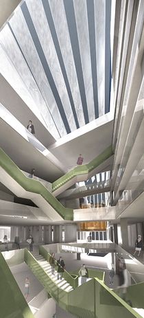
John Wardle Architects and Office dA offer a serious attempt at providing a porous organization of activity within a firm but ultimately elusive formal envelope. The building is hard to pin down, hard to draw a sketch of, but each glimpse provides a sense of ambiguous strength – permeable and porous but not transparent, openable and breathing but not systematic or inflexibly so. Their submission gets close to directly describing the horizontality (and the language) of mat-building:
“Within the building, we adopt a programmatic strategy that is implemented systematically throughout the project, a technique related to exposure, splicing and tangency. If conventional planning efforts succeed by way of stratification, compartmentalisation, and segregation, we instead propose to have each and every program linked to others in strategic ways.”
John Wardle Architects and Office dA won this competition. In terms of this review, their scheme was the most convincing version of a mat-type organizational structure while also satisfying the real constraints of site, volumetrics, buildability and architectural expression/image creation. They achieved this through a series of sophisticated conceptual strategies such as “splicing” and “tangency” and deceptively simple formal approaches (“attenuated triangle Y-tower”), along with straight architectural skill demonstrated in design development – for example, efficiently unequal floor-level heights across the section, ingeniously piggybacked lecture theatres and subtly changing facade panel modulations across each surface. Their eight submitted panels were loaded with dense information but free of hype, displaying a care of thought and process, great attention to detail and a thoroughness of approach. JWA and Office dA each have a strong design agenda and present themselves as joint authors. One gets the sense – through the inclusion on the panels of such things as excerpts from the website set up to exchange ideas between the team – that the interaction was, and will continue to be, both genuine and mutually beneficial.
I think the judges got it right. The last word, however, goes to a student quoted by Sauerbruch Hutton + NH: “The best architecture school is a hose-down shed.”
Nigel Bertram is a director of NMBW Architecture Studio and a senior lecturer in architecture at RMIT University.
The full proposals and presentations by the shortlisted teams can all be found at www.abp.unimelb.edu.au/competition
1. For example, RMIT Building 8: 70 x 60 metres x 11 levels (floor plate area 3300 square metres); Lyons’ new RMIT building: 75 x 55 metres x 11 levels (floor plate area 3200 square metres, total area 35,000 square metres).
2. Tom Avermaete, “Free University Berlin”, in Team 10: in Search of a Utopia of the Present (NAi publishers, Rotterdam, 2005), p. 186.
3. Alison Smithson, “How to Recognise and Read Mat Building”, Architectural Design, 1974.
4. In parallel, the contemporary shopping centre is moving away from a strictly internalized environment towards a more campus-like model.
5. Architect Brian Lewis, 1962–65. Ramped central courtyard roofed into an atrium by Daryl Jackson Architects in the 1980s; further upper level and facade additions by McIntyre Partnership, 1997. The floor plate dimensions of the existing building are approximately 50 x 40 metres, including the atrium.