<b>REVIEW</b> GRAHAM CRIST <b>PHOTOGRAPHY</b> TREVOR MEIN
The serrated zinc box gives way to a shaded glass skin on the eastern face.
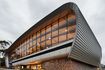
On the northern face a single opening creates the impression of one storey across two.
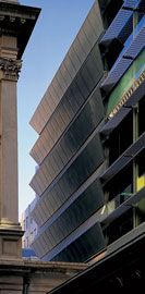
On Little Lonsdale Street glass replaces the zinc to form strip windows.
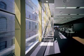
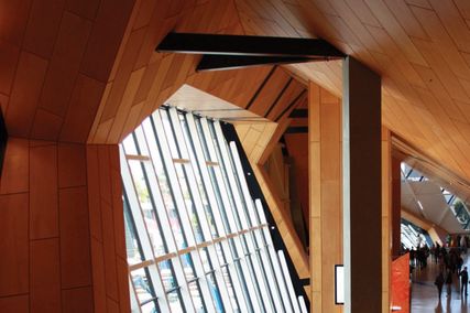
The library circulation runs along the glazed edge that completes the internal court.
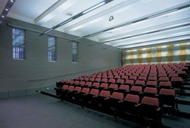
The solid and quiet, cellar-like lecture theatres sit in the old strong room.
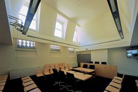
Moot room.
The lecture theatres are accessed directly from the entry courtyard.
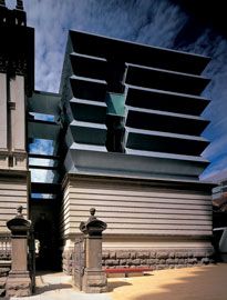
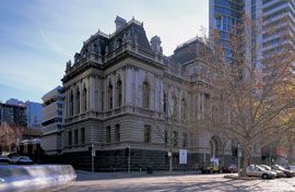
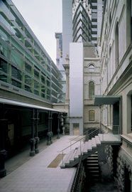
ON THE CORNER of Queen Street and Little Lonsdale Street in Melbourne is the former Public Records Office – an early twentieth-century stone building, designed by the Public Works Department in the nineteenth-century French style described as Second Empire. Just next to (or behind) this building is a heavily pleated or serrated zinc box. Substantially smaller than its neighbour, it is a surprising and arresting object. With its concertina section, some say it looks like a jack-in-the-box as it springs out of its stone base, which once constituted the strong room of the Public Records Office. This architectural extension is Peter Elliott’s latest work in Melbourne.
Victoria University has built a new law school here, which includes the Sir Zelman Cowen Centre for Continuing Legal Education. Peter Elliott’s office has designed this institution, renovating and converting the former Public Records Office and extending the space above the rear strong room up into the zinc box. The compact courtyard formed between the two buildings provides the entry to the school, with a lift tower at one end joining the two wings. The old offices remain almost entirely intact and restored; they house a range of teaching spaces, offices and a moot court, all circulated via the original grand stair over five levels.
The rear building is a contrast in scale and atmosphere. A pair of matching lecture theatres have been placed in the old strong room and are accessed directly from the courtyard opposite the main stair. These rooms seem solid and quiet, cellar-like. The motif of the folded walls above is mirrored internally at the rear of each space. Above the theatres, the zinc box contains a new law library over two levels, accessed via the glazed link and lift that joins the two wings.
The school sits within the legal precinct in Melbourne, around the north end of Queen and William streets. It is thus in close proximity to legal offices and the courts – including Hassell’s recent Family Law Court on William and Latrobe, and the newer County Court, the rear of which is only a few metres away. Directly behind Elliott’s work, to the north and seen through the gap between the Law School’s two halves, is Katsalidis’ Republic Tower, its pointed prow facing the Law School. In this area, the city has been intensely reworked through buildings that are large and architecturally prominent, and that contend for some permanent civic presence. The Victoria University project is much smaller than any of these neighbours. Yet it seems to respond to them, to bear comparison with each, just as the new wing enters into a dialogue with its partner adjacent.
There is of course a precedent for the new building’s folded skin in Peter Elliott’s oeuvre, in the Robert Clark Conservatory at Ballarat completed in 1995. There the triangulation in section of the Glass House is horizontal and vertical, following a type of triangulated portal. The transposition is a thorough one – from the open field of the Botanical Gardens to a densely surrounded urban site. A process of intense compaction has taken place. The folding is tipped over; it is solidified, and intensified.
There are a number of other ways the pleated skin of the library can be read – my perception of it shuffles among these images. One is the springing concertina – the jack-in-the-box description. In a little cartoon sketch of the building, Peter Elliott draws it with exclamation dashes around it – like a Keith Haring figure jumping. The object becomes an energetic miniature.
Second, it is an object that seems crumpled, a straight prism squashed – perhaps squashed by the weight of the context. The new insertion sits carefully at the cornice line of the adjacent 100-year-old offices, and below the large mansard roofs with which (materially) it is more akin. It is as if, in deference to the heritage building, the new addition has been pushed down to reduce its height, crumpling the skin. Whereas the mansard roof seems stretched upward, this new zinc skin is compressed, able to be pushed back down into its box.
That box – the closed stone walls of the former strong room – continues the articulation of the main offices adjacent, as a large rusticated base. This is a third reading of the new facade’s language – as large rustication. In this respect it contrasts with an idea of a miniature, or with any kinetic inferences. Rather, with its deeply carved pleats it seems hyper-rusticated – more so than the raking lines of the stone first floor or the dark, rougher base below it. In the tradition of buildings as small fragments (for example, Loos’s Chicago Tribune Tower as a column), this is, metaphorically, a base fragment of a truly enormous urban object.
Such analogies are not necessarily part of the architect’s intention, nor do they form any obvious narration of the project. They do prove, though, that as a gesture this project is engaging for a lot more than a blink. To ask more directly and dumbly: how does it “feel”? The place is part historical site, part office, part university campus. And the building manages to be all these, convincingly.
The relationship between the solid skin and the glazing of the new wing sets up further complexities and surprises. East and west, the zinc skin, which initially appears to form a complete enclosure, gives way to a flat, shaded glass skin. This sets up an intense relationship between the library interior and the original building. Around ten metres away, the rear facade of the old Public Records Office forms the backdrop to this space, and the circulation that runs along this edge. At the same time the glass completes the internal court space – in plan you can see the curtain begin where the stone wings step back to the central bay.
On the north, facing Republic Tower, a single opening is sawn out of the teeth, creating an apparent single storey across two, and intriguingly imitating the proportion of the neighbour’s classical bay. On the south face, on Little Lonsdale Street, is a third condition, and perhaps the most intriguing. The glass here simply replaces the zinc in the same plane and scale to form a strip window. It does this twice, once forming a concave window, once a convex. This provides the most explicit engagement with the cranked section from within, and externally renders the box at its most deliberately scaleless.
Many of Peter Elliott’s projects inhabit the world of the well-mannered and carefully responsible insertion, and many of them are on university campuses, especially that of the University of Melbourne. They take seriously questions about an appropriate style, or questions about style more generally. This project is of that world, which is partly what makes it surprising. Its negotiation with those conditions that constrain it makes it more stimulating, just as its designers carefully differentiate between the constraints surrounding it, and the excessive, self-imposed restraint familiar to many architects. This building manages to be a little unrestrained, just like its flamboyant neighbour.
By coincidence, the day after visiting this building, I visited the Opera House in Sydney and the National Museum of Australia in Canberra – both stunning exceptions.
We always want more of these buildings, but we know there are only ever a few. They are exceptions almost by definition – peninsulas physically and culturally. This Elliott building, though, is of a different category. It modestly takes its part in the construction of an increasingly interesting precinct, and treads the line between the solidifying of a city, and the city as a perpetual laboratory. In other words, it is somewhere between the composed consistency of some Paris, and the competing spectacle of some Houston.
The quality of buildings that are not the “main event”, the most rather than the few, is so important – important in overcoming the depressing urban structure of “signature” buildings surrounded by mediocrity. This small and relatively hidden building is both amusing and serious. Like the fine new County Court, and like the eclectic revivals that government architects once built, you could build whole cities out of projects like this.
And they would be intelligent and amusing cities.
GRAHAM CRIST IS A PARTNER IN THE MELBOURNE PRACTICE S ARCHITECTURE AND A LECTURER IN ARCHITECTURE AT RMIT UNIVERSITY.