Fiona Hall does remarkable things with Tupperware. Even more with PVC plumbing pipe, videotape (remember that pre-digital stuff?) and, perhaps most famously, with sardine tins. Recently she has been shredding, knitting and shaping camouflage military uniforms in preparation for her installation Wrong Way Time for the 56th Venice Art Biennale. Hall is the inaugural exhibitor in the Giardini’s first twenty-first-century building, the new Australian pavilion designed by Denton Corker Marshall (DCM). Here I talk to her about her work, her impressions of the pavilion and the challenges of this significant architectural induction.
Rachel Hurst: You’ve been selected as the first artist to exhibit in the new pavilion, with an installation themed around three concerns (which are also central to contemporary architecture): global politics, finances and environment. These have been recurrent themes in your work: nature, in all its proliferation, variety and vitality, and, almost contradictorily, a pessimistic, critical strain concerned with “a failed minefield of madness, badness and sadness, in equal measure.” Where exactly does the work sit – as a verdict or a challenge?

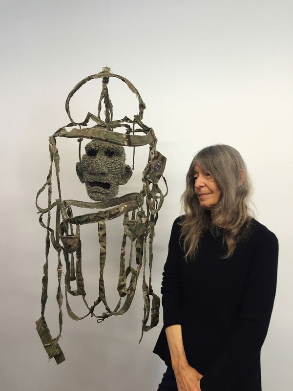
Artist Fiona Hall with a piece from All the King’s Men at a pre-Biennale preview in Adelaide.
Image: Rachel Hurst
Fiona Hall: I have a foot in both camps, though perhaps more firmly toward the pessimistic. My brain is a wacky mix of logic and illogic. I think those two things come together in a lot of my work. In Wrong Way Time, for example, I have made a new work called All the King’s Men , with military camouflage, which has its origins in nature, and when you look at it, it’s quite complex and beautiful, but has been translated to insidious ends. In contemporary warcraft it is not so much about invisibility, but a badge.
RH: I saw the teaser you showed at the launch today. It struck me as a cross between those classical Roman sculptural busts of generals or consuls, and a severed head. Very powerful …
FH: I finished it lunchtime the day before!
RH: I understand that time is the enemy, preparing for Venice, and with the intricacy of your work, that can’t be rushed. In the face of the perilous concerns that are the base of your work, your pieces have a life-affirming quality – I think due to the time and skill we recognize and admire in their making. It’s a very visible quality, and one that is pertinent to architecture at present, where traditional building skills are being lost to new technologies. While in some sectors of the art world I know there is an almost overwhelming rejection of obsessive, finessed craft as a distraction from the idea or concept.
FH: Well, perhaps it’s a similar debate with painting – that persevering with the traditional way is flying in the face of progress. To make something three-dimensional in one way or another it has to hang together, so you’re faced with a physical problem, but a sort of creative problem, how you’re going to go about that. But you have an idea and it’s linked with the innate sensibilities and abilities you have, which you’ve honed without even realizing. I’m a big subscriber to the ten-thousand-hour theory. And these sensibilities are an aspect of the kind of work I’ve done. There’s big debate about this in the art, design and architecture world: the term bespoke. The guy who makes vitrines for me, Phil Sticklen, whom I’ve worked with since 1995, the name of his company is something like Bespoke House. It was the first time I’d heard that word. Now “bespoke” is the happening thing.
RH: And moving to the topic of architecture and working in the new pavilion, how did it fit with your sensibilities? Your press release described the task as “ambitious.” In what way?
FH: That’s not my word! It’s a mighty big space … but my aim is not to fill the space up, but to make it have a resonance. If the space itself is configured so it has a resonance, then the whole feeling of being there is lifted up.
RH: If that’s your ambition, the issue of scale seems important. Your work is generally, if not small dimensionally, very intricate, small in scale, and demands close viewing. How does that work within this new expansive space?
FH: Yes – if you work small as I do, how do you physically present small works, which often need some protective aspect, not least for a show that expects to have some half a million visitors.
RH: Something of that exposure really needs to appeal at many levels, doesn’t it? Bryon Cunningham passed on a pithy summary of how an exhibition should work: it should offer something for “screamers, strollers and scholars”!

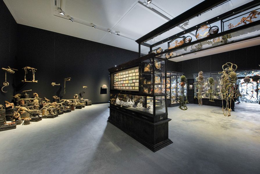
The installation’s “inner sanctum” displays All the King’s Men, a collection that considers the meaning of military camouflage in modern-day warfare.
Image: John Gollings
FH: That’s clever … yes, there’s the experience of how people walk into a space, how they walk around. So whatever scale you’re working at, that’s part of it. I’m reluctant to talk about the way I’m presenting, not just because any press release is embargoed until the launch, but also because the space is imaginary at this stage. However, a lot of my resolution about how to show work that is small, some of it fragile, is in providing some kind of in-situ housing for it. I’ve often used vitrines and so I’m using a structure of vitrines, with sections that interlock together to echo the form of the gallery interior. In the installation there is an inner sanctum one can enter into – a doughnut of cabinetry. And then over 350 individual pieces, only 10–15 percent of which are reshows. A retrospective in Venice just doesn’t cut it.
RH: No wonder time has been an issue!
FH: Yes! And to explain the title a little, there are lots of clocks – grandfather, mantle and cuckoo clocks. They are for the sound as well as the visual effect.
RH: In DCM’s description of their concept they talk about the pavilion as “looking out,” in reference to Australian architecture, which seems on paper to be at odds with the brief to set a space for internal display. But studying the design I think it does set up a receptive, accommodating attitude to exhibiting – in comparison to the previous Philip Cox pavilion, which has always been regarded as a demanding space curatorially, whereas the new building is quite mute. Do you agree?
FH: I concur with prevailing opinion that the previous pavilion was a difficult space to work with, and it severely curtailed physically what people could do with it. This isn’t a critique of the building architecturally, but of the building as a purpose-built space for displaying art and architecture. In the new building the interior space is much bigger. They’ve taken every bit of the site they could and that’s a good thing, in that competitive setting. Not utilizing it would have been a waste. I’ve been living with that space in my head virtually from day one; I received plans of it just after I’d been selected. Artists are used to working with sight unseen places, to pretty accurately imagining proportions, et cetera. I feel I know the space very well.
Logistically the architects have been really on the ball. They’re putting in a loading bay on the canal next to the pavilion, which will be great, as getting work into the site is a nightmare. My imagined feeling of the interior and the rendered images of the exterior make me think this is a fantastic space, a mute space in a very positive way. I don’t believe it will make an imposition on what artists and architects will do there, and therefore it has a lot of versatility.

Smaller artworks are displayed in vitrines with interlocking sections.
Image: John Gollings
RH: Some detractors have criticized it for being too versatile in terms of identity. That it could represent any country anywhere …
FH: Well, it’s not Australian in any iconographic way. But in going down that line you end up with a space that is very challenging to exhibitors. It’s a design from now. It’s hard to imagine it dating in a bad way.
RH: Yes, a cube is a pretty timeless architectural trope. What do you think of its almost square proportions?
FH: I’ve always loved the square. Early on in my career, when I was working principally with photography, I had one of the old square-format cameras … there’s something really fantastic for me in the square. When I saw DCM’s square design I went, “Oh yes!”
RH: How have you dealt with the pressures and opportunities to present your whole oeuvre?
FH: I knew even when I got the phone call from the commissioner that time would be my worst enemy, to realize the deadline, and I wasn’t wrong. I’m feeling like death not even warmed up! I had to think quickly and write what I was going to do within a couple of weeks. I haven’t diverged from that but it has meant thinking hard about what I want the space to feel like, how to realize that, what holds you. So to go back to your description of how people take in an exhibition, there’s a lot of art that turns you into a “screamer.” To get someone to stay with an artwork for three seconds in this sped-up day and time is a big ask. The work has to have some kind of lure, and that resides in the work, not in some kind of facade or signpost “look at me.” If it’s not in the work you can’t kid yourself.
Wrong Way Time was unveiled on 6 May 2015 in the Australian Pavilion at La Biennale di Venezia and runs until 22 November 2015.
Source
People
Published online: 14 Oct 2015
Words:
Rachel Hurst
Images:
John Gollings,
Rachel Hurst
Issue
Architecture Australia, July 2015