Do you remember those ViewMaster gizmos from the 1950s? The equivalent cutting-edge of today’s Oculus headsets, they used stereo-slide images to give a convincing three-dimensional picture of a well-known landmark or place. Something about this recent house by Neeson Murcutt Neille has me thinking about the power of both paired vision and stereotypes. In this renovation of a double-storey Victorian villa in Armadale, simultaneous alignments of perspective between architect and client, and architect and architect, give a new dimension to a beloved but often formulaic residential pattern. How to adapt a grand house with its compartmental planning to fit contemporary preferences for fluid spaces connected to landscape?
The task was to unravel a traditional plan compounded by a stereotypical 1990s extension that did nothing to use the existing house or gardens, but provided ample floor area. This was a project for Stephen Neille’s sister and brother-in-law and their three teenage children. Resisting the cliché “never work with children, animals or family,” and the initial sense that the extension “was so confused it felt impossible,” Stephen and partner Rachel Neeson (co-directors of Neeson Murcutt Neille) determined “to see if we could get anything out of it.” They set a series of key tactics: “be resourceful, work with sunlight, and unlock the potential of the landscape.”

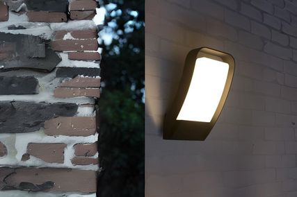
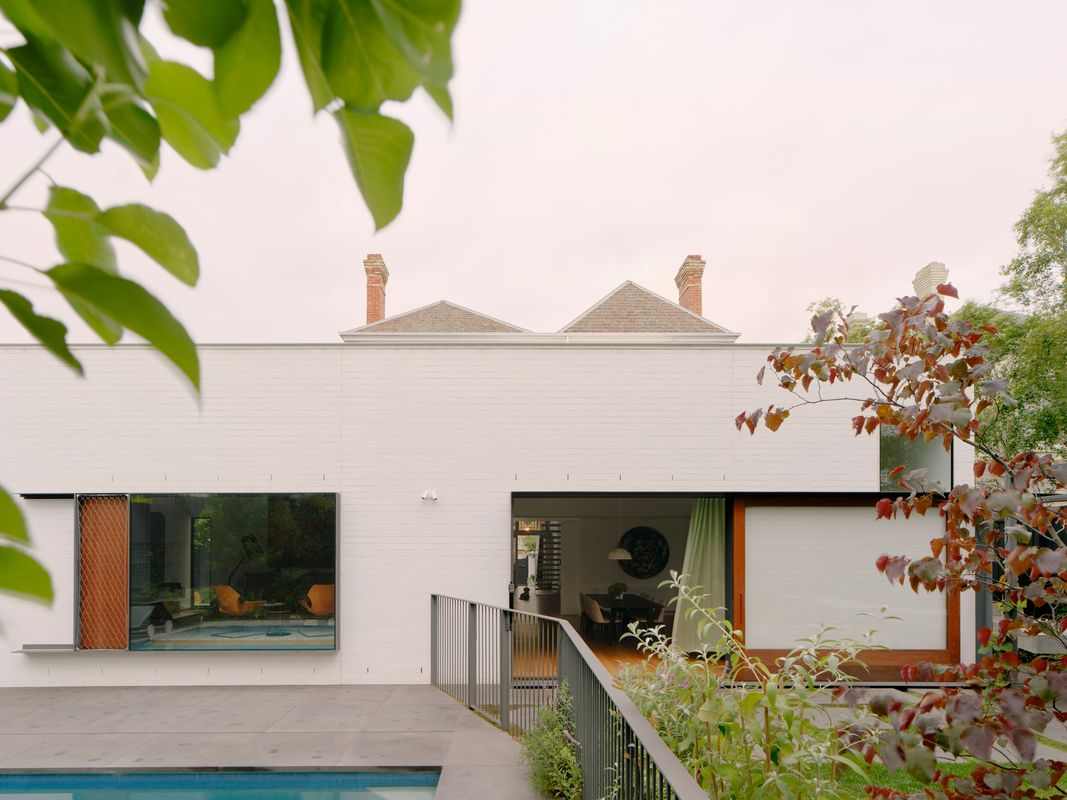
Doors, skylights and high-level windows offer varied aspect from the living spaces.
Image: Tom Ross
There is a definite economy of means in the handling of the architectural envelope: all existing walls were retained but extended vertically, acknowledging the volumes of the 1884 house. Only seven square metres were added overall, while nuanced adjustments of door and window openings are surprisingly effective in recalibrating circulation to suit modern life. Critical shifts to the disposition of rooms created new hierarchies. Instead of the usual formal rooms, the ground floor is now a convivial piano room, pool room and luxurious parents’ suite. Relocating the main bedroom to the front introduces a vertical buffer between adults and growing teenagers, allows for aging-in-place, and capitalizes on the proximity of the garden. All existing rooms are handled with a light touch, with a concept of “thick and thin” employed to heighten contrasts between old and new. Doorways became deep portals, defined by edgy steel linings, while thresholds are extended with satisfying marble slabs.
Here, “dealing lightly” has dual meanings: it describes the restrained interventions to the nineteenth-century building, but also the effort made to introduce daylight into its heart. Replacing the heavy timber staircase with an articulated folded steel version is the most radical of these moves. Though it may seem at odds with a “do no harm” approach to the heritage of the place, it eradicates the usual bottleneck to light and circulation of this customary arrangement, and reveals the sectional spine of the house, from its macro volumetric proportions to the micro of skirting and cornice profiles. Detailed to sit clear of walls and minimize the floorplate to the half-landing bathroom, it admits light through its robust yet fragile structure.

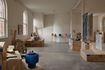
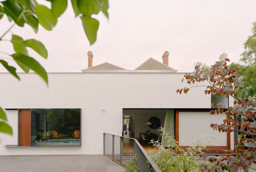
The renovation adapts an already large home, tailoring it to occupation, light and landscape. Artwork: Jo Nolan.
Image: Tom Ross
The stair’s entirely steel construction also gives a gentle acoustic beat to daily life. “It’s a kind of natural parental surveillance!” jokes Stephen’s sister, who clearly embraces the scheme’s spatial ingenuity and enhancement of family life. Each bathroom demonstrates this approach, with asymmetrical skylights or high-level windows elevating utilitarian areas to ethereal levels.
Notwithstanding judicious material selections, white and light dominate, recalling another designing partnership, Alvar and Aino Aalto. Like the work of the Aaltos, this is organic modernism, with immaculate geometric forms softened by the play of light from multiple directions and across multiple surfaces.
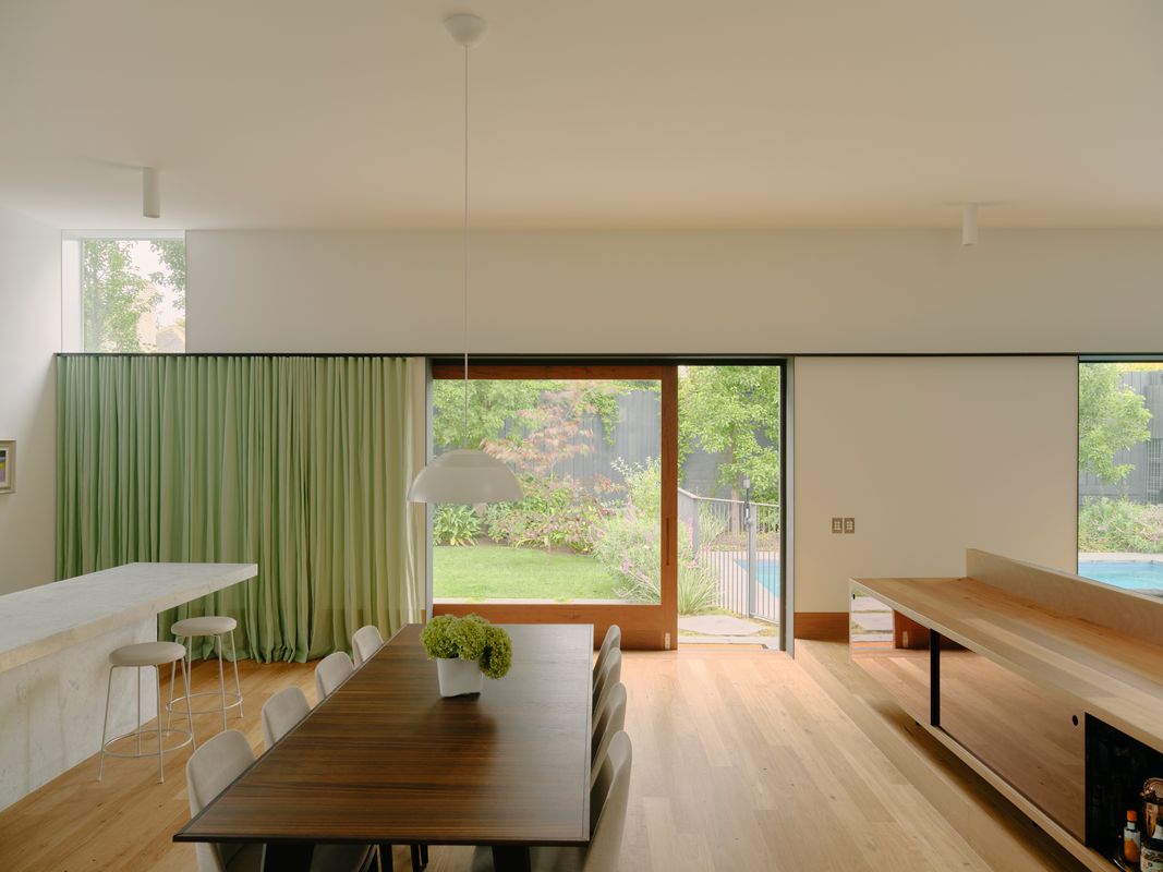
The tenet of “light on two sides of every room” is everywhere here, but also aspect and ventilation on two sides. Relationships to outside in the main living-dining-kitchen space transcend the conventional expanse of glass to rear, with five different ways to sense diurnal and seasonal rhythms from the pinwheel spot at the kitchen bench. There’s the side-garden serving hatch, views to the productive garden and pool, a tree canopy glimpsed through a skylight, the overhead clerestory, and a long axial vista to the front garden.

A new stair in the centre of the plan has improved visual and acoustic connection between floors.
Image: Tom Ross
Making place in open-plan “back-enders” can be tricky, but it is achieved here by continuing existing datums to create more intimate zones. The metrics of original skirtings determine the height of a new raised living area, floating joinery unit and timber base to kitchen cupboards. An integrated steel door-window head and wrapped wall lining unites the room and camouflages the television. Dropping the ceiling in the pantry compresses the space and directs attention to the all-important coffee hub and nearby garden water feature.
This focus on side gardens is one of the joys of the landscaping by Fiona Brockhoff Design. An overall principle to “retain but loosen” activates the good bones of the green spaces, meshing their functionality with specifics of the family and interior spaces. Every window looks onto nature or recreational pleasures: like the sculptural concrete bench and barbecue that edges from the kitchen towards a simple steel arbor (inspired by Sunday lunches at Nanna and Pop’s under a vine-covered pergola). Or, perhaps most whimsically, a miniature putting green, basketball hoop, spectator bench and spectacular outside dunny, in place of the three-car garage you might expect.
Stereotypes are paradoxical phenomena. Are they predictable, restrictive tropes, or evolved models of common sense? Stephen suggests the project is transformative because it “demonstrates you don’t have to demolish to get a good result,” but I’d suggest it’s the meticulous handling of familiar forms and relationships that is behind this intelligent transformation. Just as the evident affinity between siblings pervading this project demolishes that other old chestnut about working with family.
Products and materials
- Roofing
- Lysaght Kliplok 406 in Colorbond ‘Monument’; custom thin edge by builder/roofer powdercoated in ‘White’.
- External walls
- Commons painted brickwork; steel plate hoods and surrounds fabricated by Dalgleish Manufacturing Design in Dulux ‘Natural Steel Grey’ and ‘Ferrodor’; Scyon fibre cement sheet.
- Internal walls
- Hardset plaster; double-thickness Gyprock; oiled and recycled tallowwood skirtings.
- Windows
- Aplo steel window and door frames in Dulux ‘Ferrodor’ and ‘Natural Steel Grey’.
- Doors
- Recycled hardwood glazed doors by McKay Joinery in Dulux Intergrain timber oil; Ronstan Carlstahl X-tend stainless mesh; polyurethane and timber doors by Fineform Joinery in ‘White’.
- Flooring
- Recycled tallowwood in Bona Naturale; Tsar custom-blend carpet; Halcyon Lake carpet.
- Lighting
- Artek pendants; Tovo downlights, can lights and LED strips; Louis Poulsen pendants; Utzon pendants; Deltalight wall washers; Bega wall lights; Flos Clara wall lights.
- Kitchen
- Marble island by Fineform Joinery; Miele appliances; Bora cooktop; media-blasted stainless benchtops by builder.
- Bathroom
- Brodware City Stik tapware in ‘Satin Nickel’; Perini sealed marble floor tiles; Vola accessories and taps in ‘Stainless’.
- Heating and cooling
- Hydronic wall radiators; Mitsubishi reverse cycle airconditioning.
- External elements
- Bamstone bluestone pavers with penetrating sealer; custom pergola and trellis; custom stone water bowl feature by Fiona Brockhoff Design.
- Other
- Custom credenza joinery designed by architect and made by Cabinetsmith from timber flooring offcuts.
Credits
- Project
- Armadale House
- Architect
- Neeson Murcutt and Neille
Potts Point, Sydney, NSW, 2011, Australia
- Project Team
- Rachel Neeson, Stephen Neille, David Coleborne, Ben Dixon
- Consultants
-
Builder
Provan Built
Engineer SDA Structures
Landscape architect Fiona Brockhoff Landscape Design
- Aboriginal Nation
- Armadale House is built on the land of the Wurundjeri people of the Kulin nation.
- Site Details
-
Site type
Suburban
Site area 858 m2
Building area 377 m2
- Project Details
-
Status
Built
Completion date 2023
Design, documentation 24 months
Construction 15 months
Category Residential
Type Alts and adds
Source
Project
Published online: 17 Nov 2023
Words:
Rachel Hurst
Images:
Tom Ross
Issue
Houses, October 2023