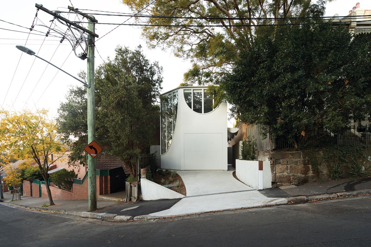
Design is essentially a process of editing. In the context of architecture, the infinite possibilities for how space and material might be assembled need to be imagined, assessed and then executed – first on paper and in models, and finally constructed at full scale. Glebe House by Chenchow Little is sited on an awkwardly shaped block, hemmed in by neighbours. The compact dwelling was designed for a family of five and conveys a succinct architectural approach based on skilful editing.
Described by practice director Tony Chenchow as “an exploration of volume, form and light,” Glebe House reflects the architects’ resolute commitment to expanding the sculptural potential of architecture. Beginning with a solid form, derived by extruding the occupiable site area as dictated by local council setback requirements, the architects strategically carved away at the building envelope to create windows and voids that allow the interior to be bathed in natural light. “When you have the living room on the ground floor on an inner-city site [like this], it can be quite dark,” says Tony. “For us, it’s really about how we maximize light from the top as well as the view to tree canopies and the sky.”

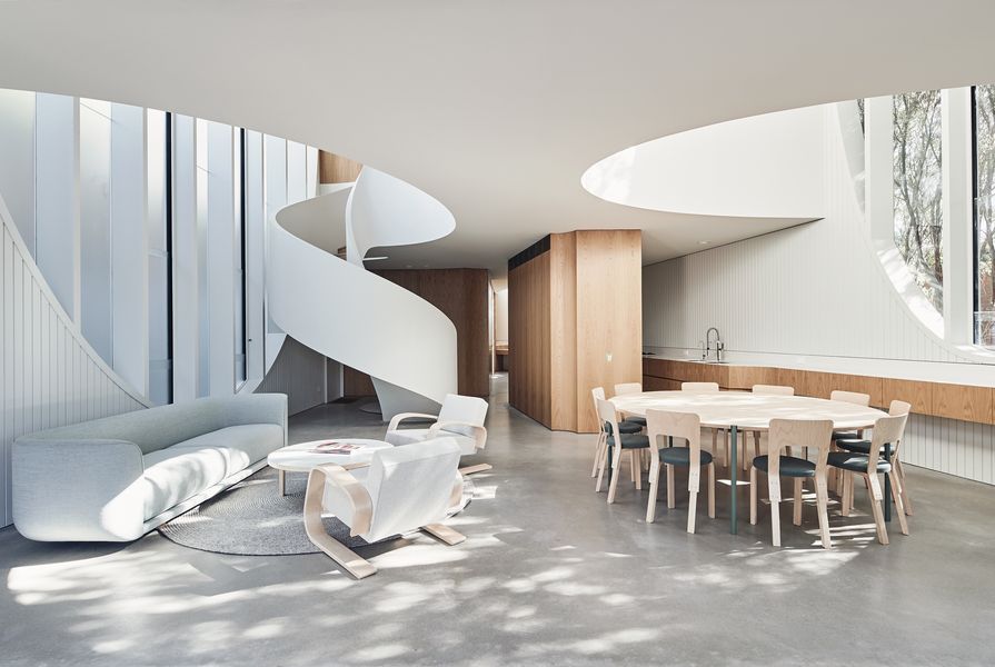
A play with geometry has been used to blur the distinction between inside and outside.
Image: Peter Bennetts
What has resulted is a Swiss-cheese-like architecture of seemingly irregular curves and hollows. “It’s a combination of something that’s quite logical and at the same time intuitive,” explains Tony. “The geometry is very elastic; some of the curves are circular but others are stretched to fit the space.” While the relationship between the parabolic arch windows and voids becomes clear as you examine the junctions internally, an unfolded plan and elevation diagram drawn by the architects exposes the logical connection between these emphatic architectural elements.
Glebe House is the latest iteration of spatial gameplay in Chenchow Little’s repertoire. “We like playing with geometry – whether it’s triangular, faceted or circular, it’s the same principle,” says Tony. “We use geometry to blur the experience of what’s inside and outside in a way that elongates the space. When you start slicing off corners and cutting out openings, you begin to dissolve the building.” Once inside the house, the heft of the openings becomes apparent. Deep sills milled from solid timber sit within walls that, despite being built using lightweight construction, appear weighty and substantial. With their arches inverted, the parabolic windows effectively obscure the periphery, cutting out views to the neighbours while maximizing the perceptible amount of sky.

Upstairs, the points where adjacent walls meet are made concave to skirt around downlights.
Image: Peter Bennetts
The measured method applied to the design of the walls, windows and voids has been extended to each space in the home, which have been sculpted at a more intimate scale by the insertion of fluid joinery items that support the day-to-day needs of family life. Running along the northern edge of the plan, a suspended bench unifies the galley kitchen and the dining room, while an oak-veneered service core, which conceals storage and appliances, subtly divides the kitchen from the living spaces, making the otherwise open plan more functional. Adjacent to this, a long study desk for homework and drawing sits beneath the double height of the western corner window. Upstairs in the hallway-cum-gallery, which is flanked by broad, curved voids, the points where adjacent walls meet are made concave to skirt around strategically placed downlights. Paying reverence to the owners’ art collection, the architects moved the door to the main bedroom off axis allowing an artwork to hold prime position in the sightline.
In keeping with the modest scale of the rest of the house, the bedrooms are allocated only the space necessary to comfortably envelope a bed. Inverted-arched windows offer each room its own character, creating an edited relationship to surrounding trees, neighbours and the street.
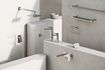
Far from ostentatious, the interior is wrapped with materials and surfaces that were selected to enhance the home’s sculptural quality and for their ability to carry the patina of life. The bathrooms, lined in simple penny-round tiles, are devoid of excessive finishes; their quality relies on the spatial integrity of the rooms and their relationship to the skylights and windows. The colour throughout the home – from the walls, window frames and finishes to the exterior facia, guttering and even the roof – is limited to a single shade of muted green-grey, heightening the experience of space and light.

Bedrooms are modest in size, in keeping with the carefully edited nature of the house.
Image: Peter Bennetts
The architectural detailing expresses the building’s assemblage; for instance, the point at which the study desk is cut away leaves breathing space for a steel column that sits in line with the apex of the window and steps away from the wall, demystifying how the architecture has been achieved. Where ornament is introduced to the composition, it is done so as a playful exaggeration of the filigree that adorns the Victorian terraces in the surrounding neighbourhood. A scalloped steel entry portico and crescent-shaped frosted glazing between window mullions rewrites the historical language.
These considered design decisions and careful editing have resulted in architecture in which the unnecessary has been completely omitted. The elements that make the cut are strictly those that play a role in the functionality of the home and in realizing the architects’ sculptural intent.
Products and materials
- Roofing
- Lysaght Klip-lok in Colorbond ‘Surfmist’
- External walls
- Sculptform spotted gum cladding in Dulux ‘Colorbond Surfmist’ Internal walls: Sculptform banjo pine cladding in Dulux ‘Colorbond Surfmist’; American oak veneer Windows: Custom timber windows by Windoor in Dulux ‘Colorbond Surfmist’ Doors: Schüco sliding doors
- Flooring
- Polished concrete slab; solid oak timber floorboards
- Lighting
- Flos OK suspension lights; Louis Poulsen AJ 50 wall lights; Artemide Teti; Artek Bilberry pendant light by Alvar Aalto
- Kitchen
- Corian benchtop in ‘Cameo White’; custom American oak veneer joinery in clear polyurethane ‘satin’ finish; Siemens gas cooktop; Sirius downdraft rangehood; Miele appliances; Fisher and Paykel integrated dish drawers; Blanco undermount sinks; Blanco tapware; Zip filter tap
- Bathroom
- Bettertiles penny-round mosaic tiles; Candana basins; tapware and toilet from Rogerseller; Kaldewei bath
- Heating and cooling
- Daikin split system air-conditioning; Bosch underfloor heating
- Other
- Custom dining table by JP Finsbury; custom master bed by David Muston; Artek 400 ‘Tank’ armchair, Table 90A, Stool 60 and Chair 66 by Alvar Aalto from Anibou; Nau Fat Tulip sofa and Nest tables by Adam Goodrum from Cult; Armadillo and Co rugs
Credits
- Project
- Glebe House
- Architect
- Chenchow Little
Sydney, NSW, Australia
- Project Team
- Tony Chenchow, Stephanie Little, Mark Hill, Joshua Mulford
- Consultants
-
Arborist
Earthscape Horticultural Services
Builder Lochbuild
Environmental consultant Damian O’Toole Town Planning
Heritage consultant City Plan Group
Hydraulic engineer Taylor Consulting
Landscaping Spirit Level Designs
Quantity surveyor Bayley Donald and Associates
Structural engineer Benvenuti S.C.
Town planning Mersonn Pty Ltd
Traffic consultant Traffix
- Site Details
-
Location
Glebe,
Sydney,
NSW,
Australia
Site area 374 m2
Building area 202 m2
- Project Details
-
Status
Built
Design, documentation 16 months
Construction 24 months
Category Residential
Type New houses
Source
Project
Published online: 11 Dec 2019
Words:
Gemma Savio
Images:
Peter Bennetts
Issue
Houses, October 2019