In the context of Australian urban development, it’s unusual to experience a public building that is so far in advance of everything else. I don’t just mean this as a judgement of the architectural quality of Green Square Library and Plaza by Studio Hollenstein in association with Stewart Architecture; I mean it literally. The building has arrived before much of what would provide its raison d’être – a locally housed urban population. The much-masterplanned urban node of Sydney’s Green Square still struggles to assert itself amid lingering light industry and roads heavy with through traffic. For pedestrians, ongoing construction adjacent to the site makes reaching the library from Green Square train station – one stop from Central – a difficult quest, though plenty have succeeded.
On a recent mid-Friday afternoon, the library was happily full – not overflowing, nor even bustling, but used, which is impressive for a public building this new. An event was taking place in the cafe space, readers worked away silently on their laptops, a neat pram park signified children at play, and school students traversed the inside and outside spaces in a semi boisterous way, as if they were still finding the edges of what such a building could be for them.

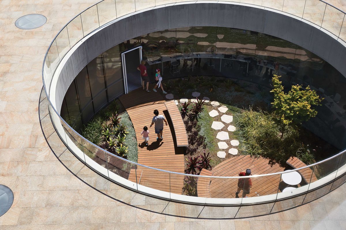
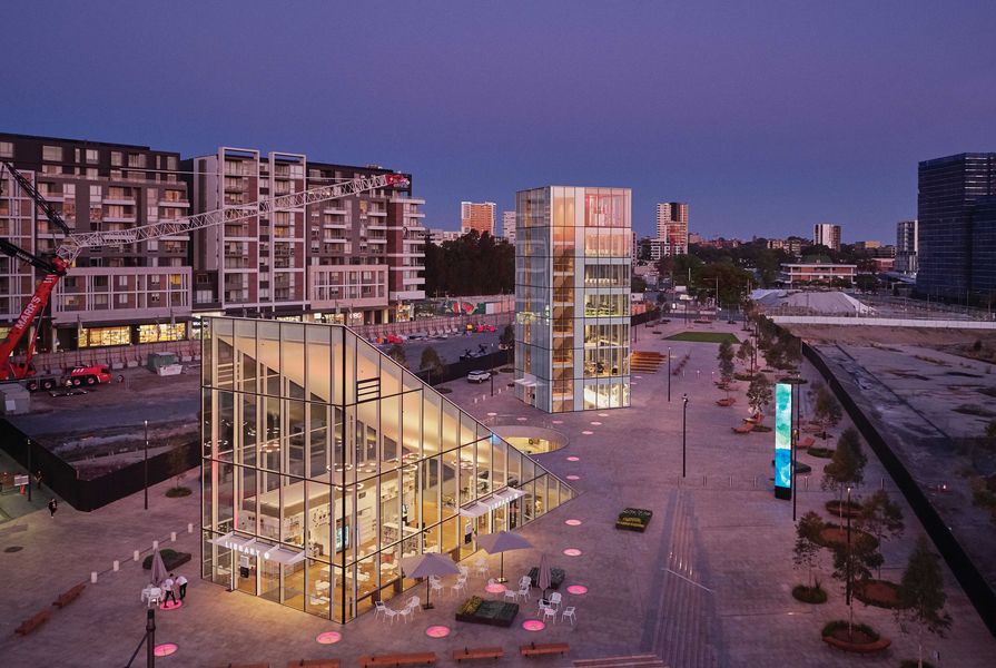
Locating the library underground maximizes the space available for the public plaza and disrupts the traditional hierarchy of building and plaza.
Image: Tom Roe
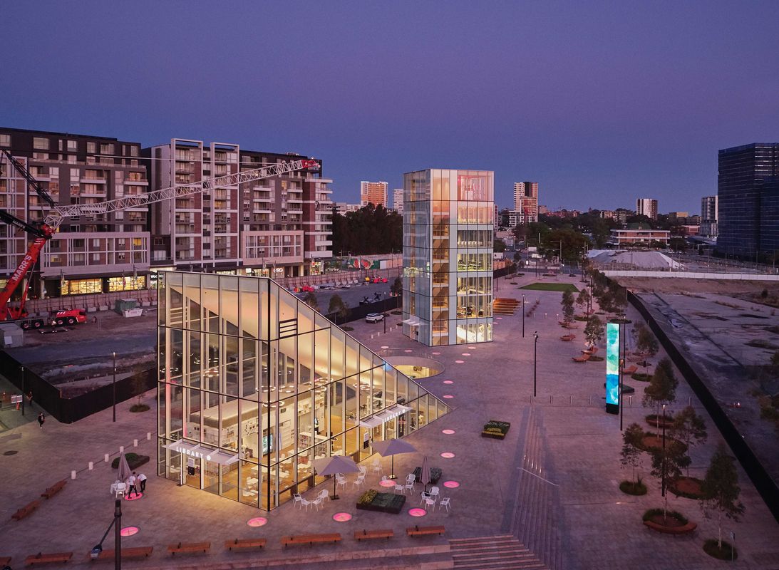
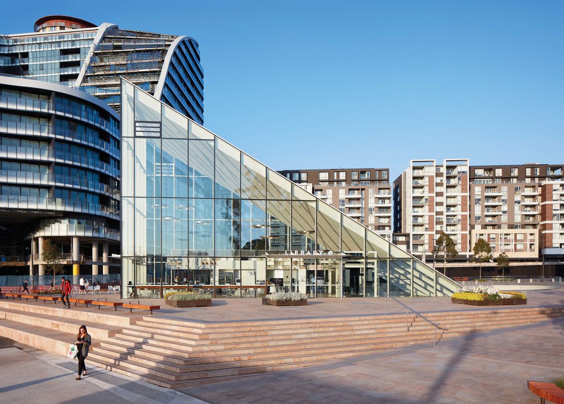
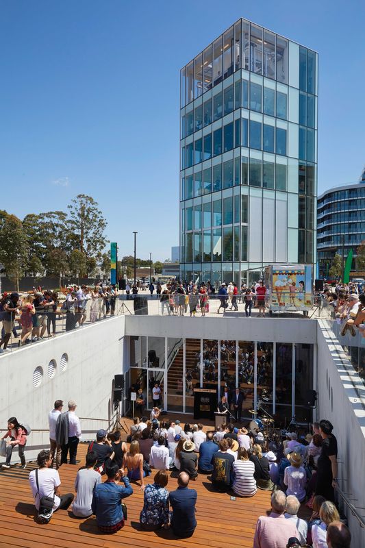
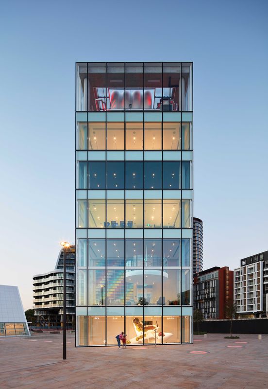
The building’s general organization takes its cues from the wedge-shaped site. Botany Road, a major traffic artery, marks the western edge, with a secondary road to the east. Faced with a brief that required a library as well as a public plaza, the architects buried the single library floor underground, extending it to the edges of the site’s buildable area. This enabled the plaza to extend across the whole site, incorporating the easements along the site’s long edges. What could be called “building elements” are distributed across the plaza, plugging into the library floor. There is a triangular entry pavilion and a tower square in plan, as well as two sunken voids: a circular garden and an amphitheatre. Circular skylights, flush with the pavement, dot the plaza and light the floor below.
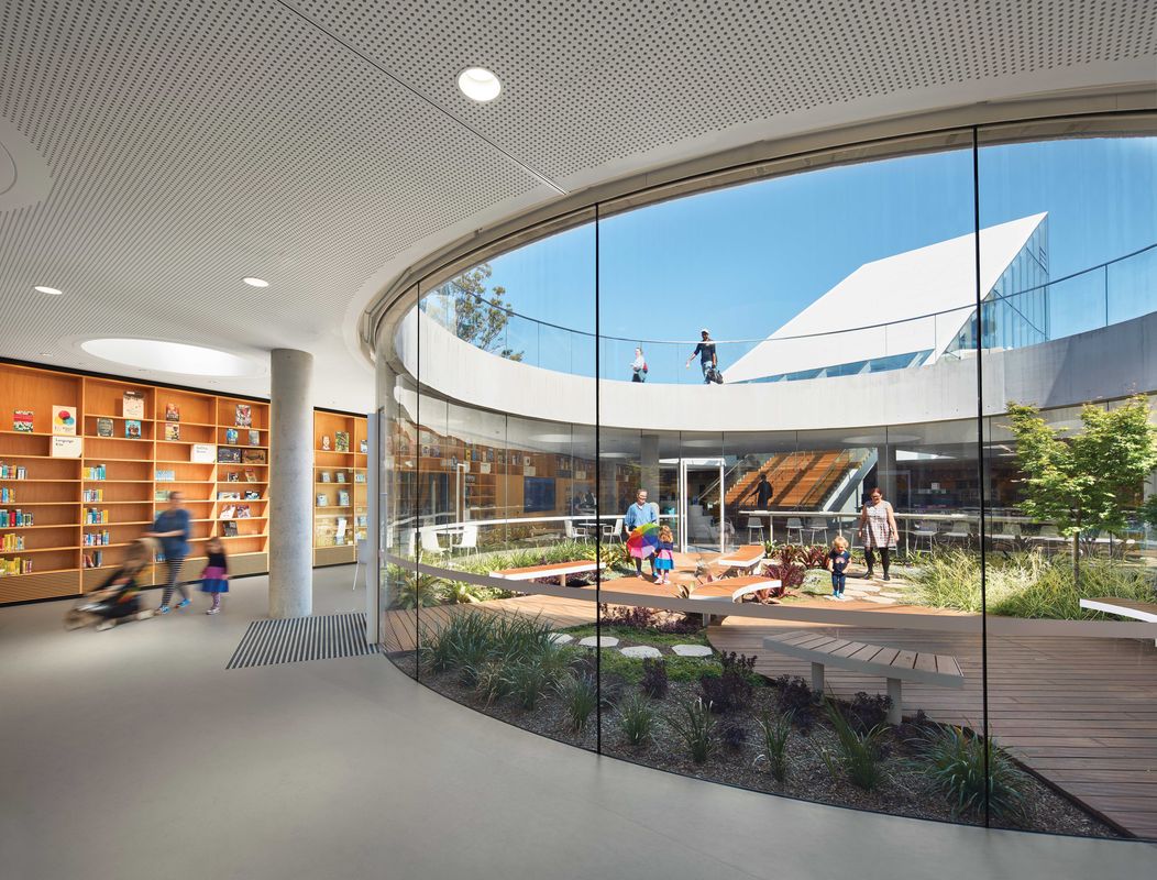
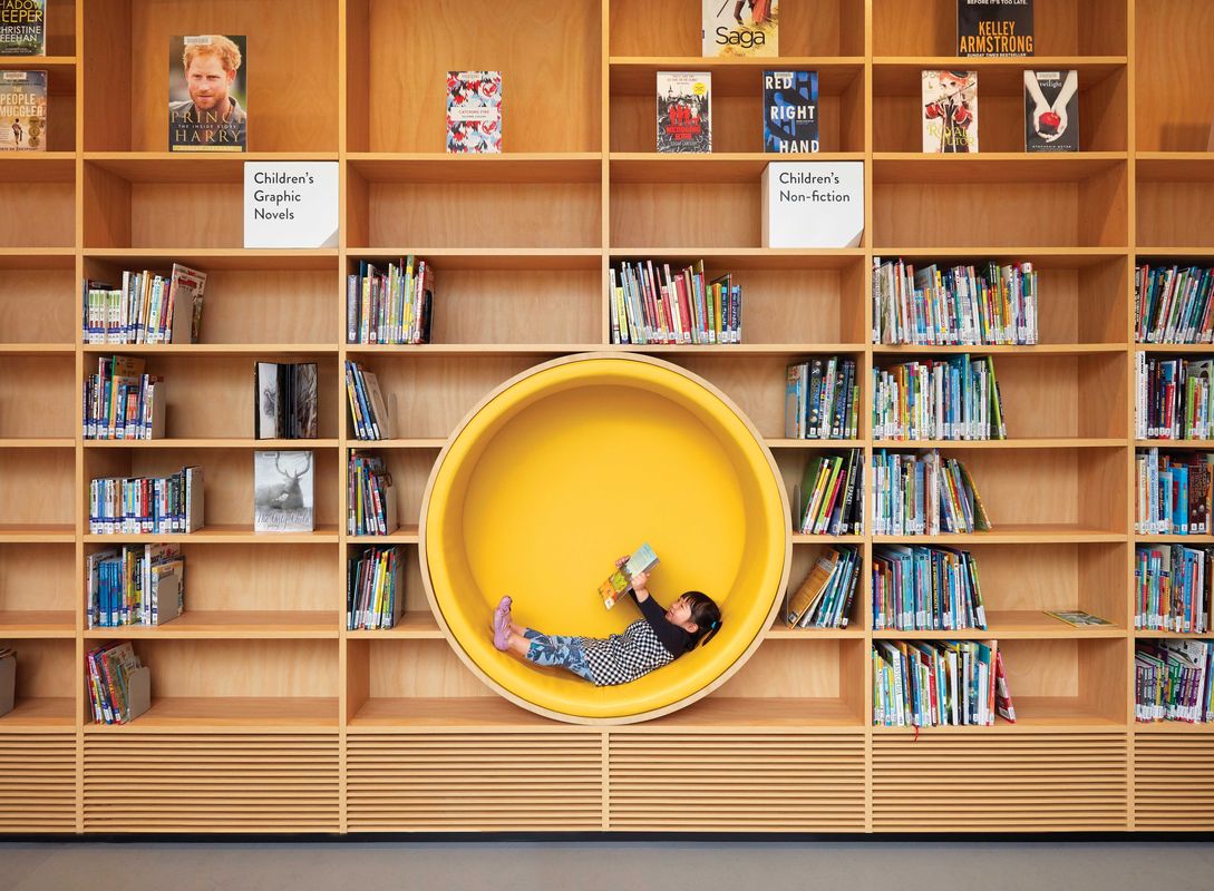
Scale-wise, these building elements initially appear a little perplexing. The tower, which ought to be the dominant object, seems too small (each level is just one room). By contrast, the entry pavilion, incorporating the cafe, looms large. This is especially confusing given that the library is not really organized via a conventional entry sequence. Instead, it offers its users a sense of open traversal. One can enter through the nominal entry pavilion at the western end of the plaza, or via the amphitheatre at the eastern end. This sets up a kind of seamless loop between plaza and library floor. This seamlessness is amplified by the lack of physical barriers between different functional zones on the library floor. The width and position of the circular garden and the tower’s footprint are calculated to differentiate internal zones, and it is just as easy to move outside into the garden or the amphitheatre or up into the tower as it is to go from the stacks to the children’s zone.

The library’s legible geometric built objects and voids will be framed as the Green Square precinct evolves.
Image: Tom Roe
In this sense, there is a loosening of the division between inside and outside across the library’s different zones. This is underscored visually. From the garden one can look up at the entry pavilion and tower and read them as “external” objects. Similarly, looking down on the garden or across to the pavilion from the tower produces a similar reading of their exteriority. The overall effect is urban – that is, it doesn’t offer the experience of being in a single building, nor of being inside or outside in any conventional architectural sense.
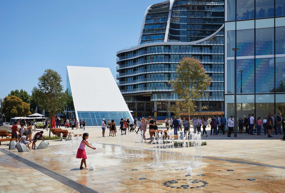
Currently, the spatial definition of the plaza is rather diffuse due to the fact that the surrounding lots are not yet built upon. Because it extends to the edges of these lots, the plaza will become progressively more defined as the adjacent apartment buildings rise up. When this occurs, the library’s building elements, its objects and voids, will be clearly framed, in this way becoming more self-referential and, due to their indistinct scale, more model-like. One could easily imagine the arrangement taking on different dimensions and functions, amplifying the design’s urban effect: the entry pavilion might be something like an entrance to a transit facility; the library floor an extensive, mixed-use concourse; and the tower a commercial building plugging into this infrastructural arrangement. The design prompts these imaginative leaps because it acts as a kind of diorama, an arrangement that could flex into different scales and conditions.
In this way, the Green Square Library and Plaza activates a category lost to contemporary architectural criticism: topology (no, not typology). In the mid-1950s, critic Reyner Banham deployed topology to explain how a building or design might exhibit a clear, graspable image through a coherent yet informal organization, one that didn’t necessarily rely on proportion, scale and hierarchy. This project does just that – through its indistinct scale and the way it encourages visitors to traverse the space, it suspends the usual organizational sequences and hierarchies of both library and plaza. At the same time, as a design, it makes these interrelationships topologically clear. It provides a strong “image,” as Banham would say.
As such, the design can be considered not in terms of its excellence as a library and plaza, but rather as a spatial arrangement that says something about the contemporary condition of cities. Considered in terms of topology, the design demonstrates that inside and outside have become spatially complex. It can be seen as an intensive connector and distributor of bodies and things, where movement and stasis are differentiated and yet coexist, and inside and outside are states contingent upon relative position rather than fixed definition.

Different functions within the library floor remain connected, extending the design’s emphasis on informal and flexible use.
Image: Tom Roe
The design has rightly been lauded in typological terms and was recently named the world’s best library by the British Architectural Review. That magazine, in 1955, published Banham’s thoughts on topology in an article entitled “The New Brutalism.” Brutalism is generally remembered as an ethic of materials and, in recent years, typology has emerged as the Architectural Review’s dominant critical category. All of this perhaps shows topology to be abstruse and outmoded. While criticism framed by functional type and material sensibility is a common contemporary approach, topologically speaking, Green Square Library and Plaza offers a much more interesting opportunity to the critic, and to the user: the chance to think a little differently about the space of the city amid the messy reality of its making.
—Charles Rice is professor of architecture at the University of Technology Sydney.
Credits
- Project
- Green Square Library and Plaza
- Architect
-
Studio Hollenstein in association with Stewart Architecture
- Project Team
- Matthias Hollenstein, Felicity Stewart, Matthew Hunter, Tom Vandenberg, Simon David, Troy Cook, Rachel Wan, Manus Leung, Chris Thorpe, Marcus Graham, Mark Craswell, Michael Hatch, Lauren Beattie, Blake O’Neill
- Consultants
-
Builder
John Holland Group
Engineer Arup
Landscape architect Hassell
Public art coordinator Jess Scully
Signage, wayfinding and heritage interpretation Collider
Waterproofing Ross Taylor and Associates
- Site Details
-
Location
Sydney,
NSW,
Australia
Site type Urban
- Project Details
-
Status
Built
Category Landscape / urban, Public / cultural
Type Libraries, Public domain