The claim that the new $60.5 million gallery at the Home of the Arts (HOTA) unapologetically reflects the “bold and brash” personality of the Gold Coast originated in the media releases timed for its opening on 8 May and was taken up in the echolalia of news cycles. Of course, the Gold Coast is more than beaches, theme parks and real estate speculation. It’s also Pentecostal mega-churches, a hotspot of domestic violence,1 a suburban hinterland that threatens dwindling koala habitat, and a home to two universities. But if the city exceeds the superlatives used to sell it as a tourist destination, is its new gallery likewise more nuanced than its facade and marketing copy suggest?
An alternative story is in circulation about the design, by the Melbourne-based ARM Architecture. From a collection of more than 4,400 works of art, HOTA gallerists selected William Robinson’s The Rainforest (1990) as a piece representative of the gallery’s locale, history and aspirations. It was to become a touchstone for the evolving design. Awarded the 1990 Wynne Prize for landscape painting, The Rainforest employs longstanding High Victorian traditions. At the time of its creation, the work was out of step with contemporary art, and Robinson’s vision of the forest feels even more nostalgic 30 years later. Moreover, it’s a piece that is not especially representative of the collection. An extraordinary 46 percent of HOTA’s collection is produced by women, and there is also a significant body of work by Indigenous Australians. Much of the collection has been amassed through strategic purchase of emerging local artists, a point reinforced at the opening show of commissions from local artists across a range of media. The Rainforest, on the other hand, was an expensive purchase – much debated by members of the public and within the Gold Coast City Council – by a well-established artist.

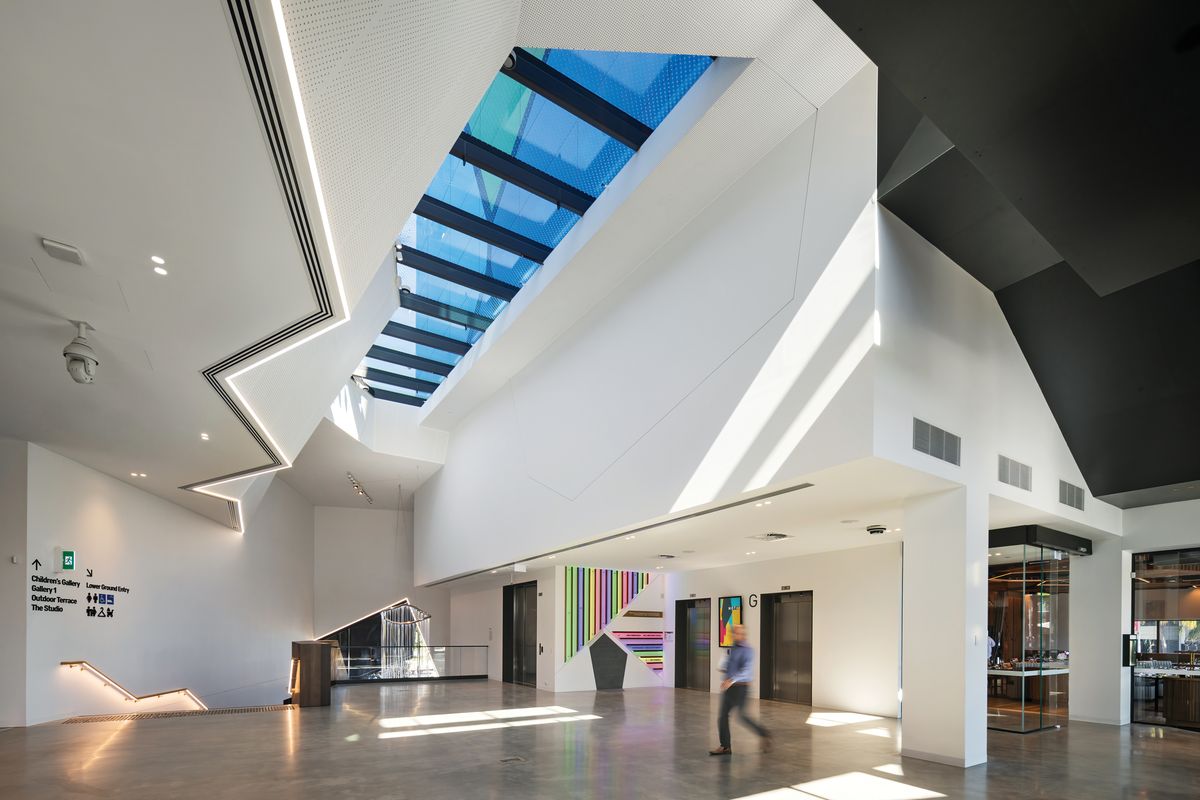
The interiors establish a convivial atmosphere in line with HOTA Gallery’s ambition to attract a broader audience.
Image: John Gollings
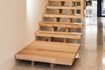
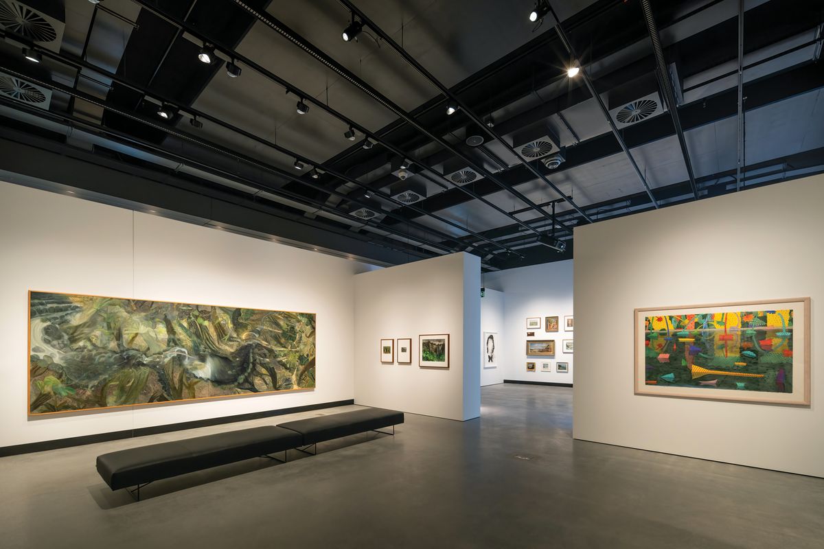
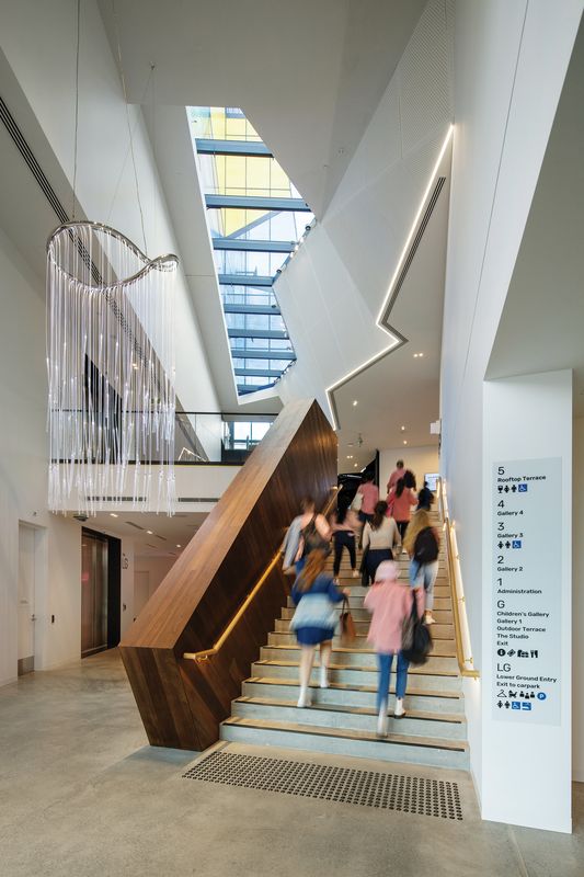
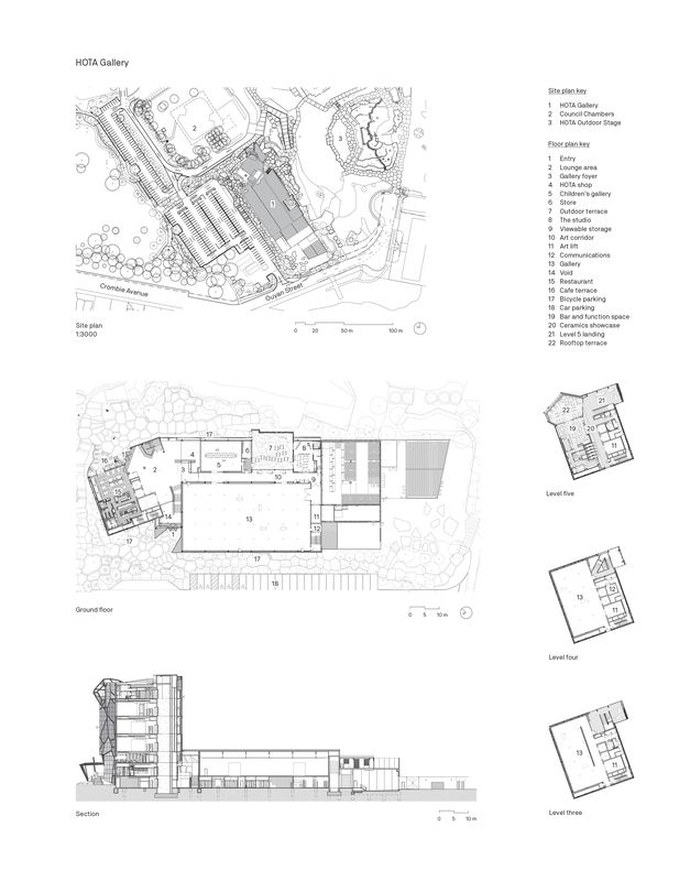
Nevertheless, presented with The Rainforest as a referential and symbolic artefact, ARM has attended thoughtfully to Robinson’s portrayal of the immersive and meandering experience of walking through the rainforest. The engagement with the work has been productive. The south entry from the car park begins at the basement level, alongside 1,000 square metres of workspace and collection and crate storage. Immediately presented with a stair, visitors rise to a foyer leading to the main exhibition space, a shop, a restaurant and a dedicated children’s gallery designed by Brisbane-based PHAB Architects. From this floor, there is a view down to the storage area. While the main gallery wing is horizontally organized and the art is the focus of its white-box column-free gallery, the essence of the project’s architectural qualities lies in the path one takes to reach the four floors of the tower.

From the foyer, visitors can access the main exhibition space, a shop, a restaurant and a dedicated children’s gallery designed by Phab Architects.
Image: John Gollings
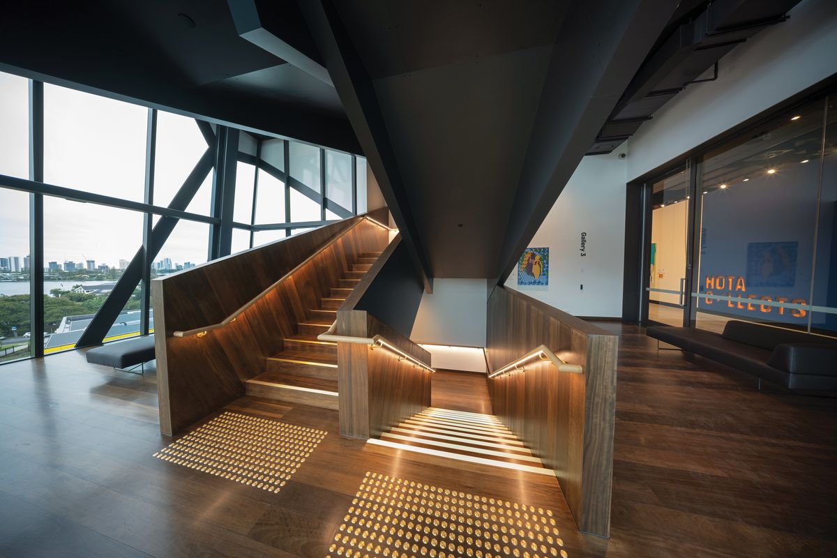
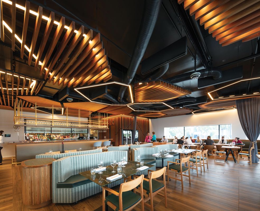
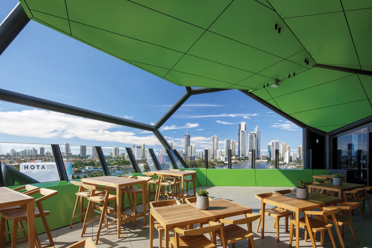
The flights of stairs shift direction at each floor, recalling the oblique paths one must take to climb up the banks of riparian rainforest. Views out to the west – of the coastline and its highrise hotels and apartment buildings – are prioritized at landings between each of the floors, allowing visitors to pause and reflect before rising or descending to the next gallery. Alongside each of the three tower galleries are framed views in the opposite direction, to the hinterland. The stair balustrades are lined in dark hardwood planks, and a similarly sombre palette of colours and materials is found in the corridors and public spaces throughout the interiors. The tower is capped by a cafe with a deeply sheltered, almost cave-like terrace, and a more formal restaurant opens to the ground floor and the amphitheatre beyond. The composition of spaces from understorey to canopy reinforces the relationship to The Rainforest and, importantly for the curators, allows the architecture to recede and the art to dominate. The intimate galleries in the tower encourage the installation of works such that each has presence and a strong conceptual relationship with its neighbours. This is a very legible organization of spaces, easy to circumnavigate and understand. The scale and demeanour of the interiors establish a convivial atmosphere that is rarely found in public galleries of this quality, consistent with HOTA Gallery’s ambition to broaden its audiences.

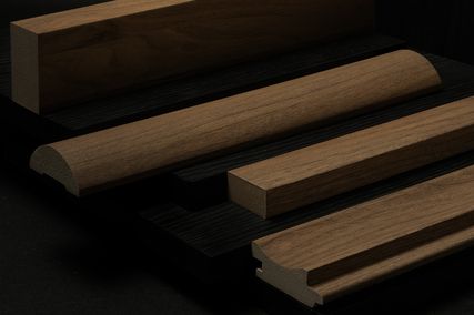
The dark hardwood planks used for the stair balustrades contrast with the white-box nature of the gallery spaces. Artwork: Eterne, Lisa Sorbie Martin, 2021.
Image: John Gollings
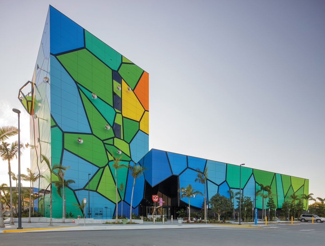
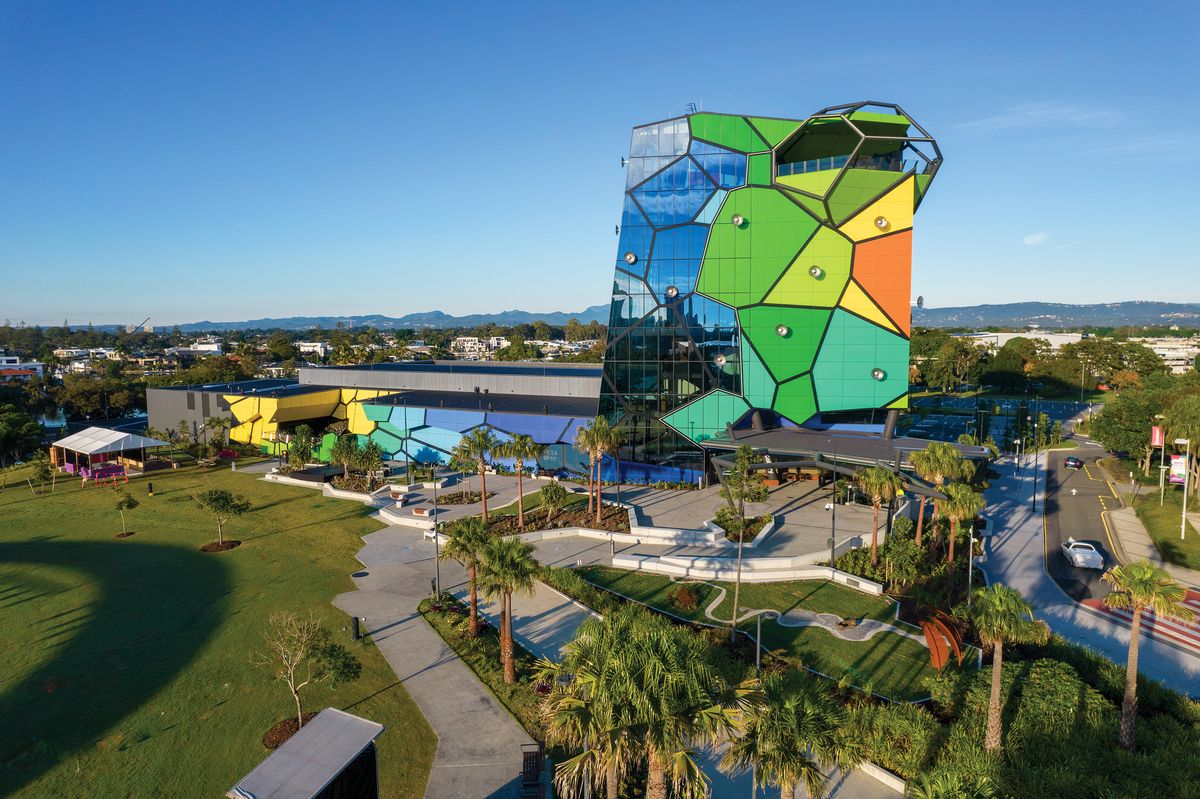
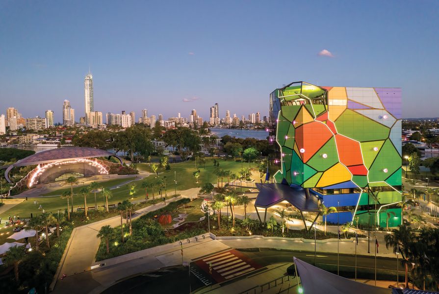
Which brings us back to the question of what the building’s exterior expression achieves. The building’s envelope is dominated by primary colours in a Voronoi pattern that predates the introduction of The Rainforest as a reference. The Voronoi pattern was the organizing principle of ARM’s entry for the Gold Coast Cultural Precinct Design Competition won in 2013 (an earlier competition for the precinct was won by Super Colossal but not implemented). ARM believed its geometry would establish a responsive, scalable and democratic structuring principle for a site that was, inevitably, going to be developed as successive sub-projects over the coming decades.
What began as a convincing planning strategy, however, has transformed into a symbolic motif. The earlier stage and amphitheatre for the precinct saw the Voronoi subjected to “heavy use”, as Patrick Hunn described it on ArchitectureAU in 2018.2 With the HOTA gallery in place, the amphitheatre’s use of the pattern now looks delicate. Applied to HOTA’s surface at gigantic scale in primary colours, it renders the building something of a billboard in both its flatness and its visibility from afar. An abstract and surficial architectural expression is consistent with the fact that securing a AAA-rated gallery essentially requires an introverted, sunlight- and temperature-controlled environment. As a space for spectacle and consumption, the gallery and museum are not unlike big-box retail, with shopping centres and galleries sharing organizational and envelope strategies for some decades now, despite those who remain convinced of the transcendental potential of the artistic encounter.

With six levels and more than 2,000 square metres of exhibition space, HOTA Gallery is Australia’s largest public gallery outside a capital city.
Image: John Gollings
The Gold Coast City Council has embraced the Voronoi motif as if it had been invented especially for the region and this precinct, which clearly is not the case. ARM has previously deployed the pattern in the facade of the Melbourne Recital Centre and the interstitial space at the base of the Swanston Square apartment tower. It has also appeared on the M24 apartments in Perth, where the “bubbly facade” is supposed to relate to the site’s previous use as an aerated drinks factory. Several years before ARM, in 2003, PTW Architects used the pattern – which presents an easy way to wallpaper a building regardless of its shape, function or spatial organization – for the envelope of its winning entry for the Beijing Aquatic Centre competition. Its ubiquity in nature – in leaves, butterfly wings, bubbles – lends it a narrative versatility on par with its geometric malleability. It is these same qualities that mean we are – I hope – on the other side of peak Voronoi. It remains to be seen, however, whether the city council will hold ARM to the masterplan or allow the firm an opportunity to suggest alternative cultural narratives for the Gold Coast’s architectural expression – as has occurred within the gallery – in the next stages of the precinct’s development.
1. Kimberley Bernard, Sarah Cumming, Tara Cassidy, “Gold Coast’s domestic violence problems leave advocates struggling to cope with number of women needing help,” ABC News, 23 April 2021 (accessed 31 May 2021).
2. Patrick Hunn, “First Gold Coast Cultural Precinct project opens,” ArchitectureAU, 7 February 2018, architectureau.com/articles/first-gold-coast-cultural-precinct-project-opens (accessed 4 June 2021).
Credits
- Project
- HOTA Gallery by ARM Architecture
- Architect
- ARM Architecture
Australia
- Project Team
- Howard Raggatt, Jesse Judd, Aaron Poupard, Georgia Eade, Jenny Watson, Emilia Meinero, Rocio Battle, Amber Stewart, Natalie Iannello
- Client
-
City of Gold Coast
- Consultants
-
Acoustics
Ask Consulting Engineers
BCA and DDA compliance consultant McKenzie Group
Electrical, hydraulic, AV, ICT and security engineer Aurecon
Exhibition, gallery, conservation handling and storage consultant Thylacine
Fire engineer Omnii
Kitchen consultant Food Service Design Australia
Landscape architect Cusp, Topotek 1
Managing contractor Hansen Yuncken
Mechanical and fire services WSP
Signage and wayfinding MAAT
Specialist lighting Electrolight
Structural, facades, civil, ESD, vertical transport, wind, waste and traffic engineer Arup
- Aboriginal Nation
- Built on the land of the Kombumerri people of the Yugambeh language group
- Site Details
-
Location
Gold Coast,
Qld,
Australia
Site type Suburban
- Project Details
-
Status
Built
Completion date 2021
Category Public / cultural
Type Culture / arts
Source
Project
Published online: 2 Nov 2021
Words:
Sandra Kaji-O'Grady
Images:
ARM Architecture,
John Gollings
Issue
Architecture Australia, September 2021