It’s tempting to call this house alteration “slow architecture,” since its big idea was incubated over a few years, as its creators scoured the Sydney property market for a smallish place with potential.
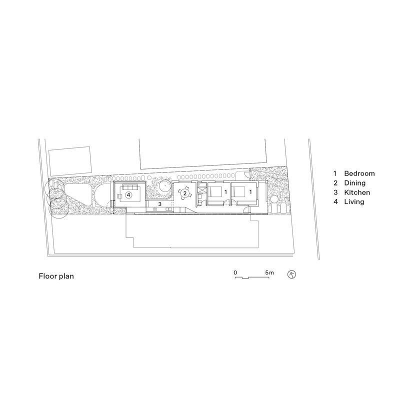
Architects Jemima Retallack and Mitchell Thompson took a single-storey Federation-era semi and radically transformed it into a hidden oasis, where galley kitchen, dining and living rooms all converge around a central garden. The additions are minuscule, but delightful.
“We’d seen a lot of small houses in our search, and they all have a common problem – the rear section is small and dark – so we’ve thought a lot about how to fix that. Instead of tacking over-scaled rooms onto the back, which sadly is a typical response, we started playing with the idea of removing as much structure as possible,” says Jemima.
They found the compact semi in Lilyfield, a quiet pocket of Sydney’s inner west, where old parks and the occasional corner shop convey a neighbourhood village feel. Designed for Jemima’s mother Bridget, a retired science researcher, the project became a labour of love. Its name, House for a Garden, encapsulates the brief.

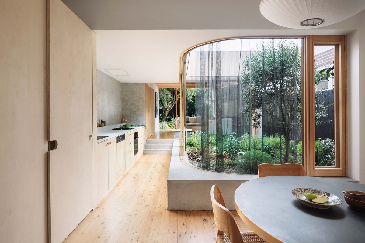
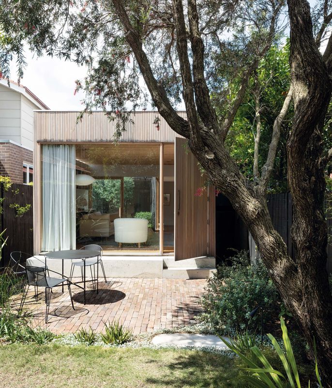
Modestly scaled rooms borrow space and light from the garden.
Image: Benjamin Hosking
“I wanted a home to grow old in, all on one level,” says Bridget. “Main rooms with a relationship to the garden, then a place to sleep, to cook and eat, to read and listen to music. Nothing more. I didn’t need extra rooms and, contrary to real estate agents’ advice, I didn’t want a second storey.”
The original two-bedroom brick semi was dilapidated and damp, but the bones were all there, ripe for restoration. It sits at the lowest point of the street, triggering a flood-zone regulation for any additional space. The living room was small and dark, and a shoddy lean-to kitchen and outside loo had been tacked on. Internally, it was no larger than 79 square metres.
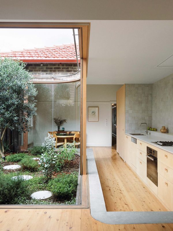
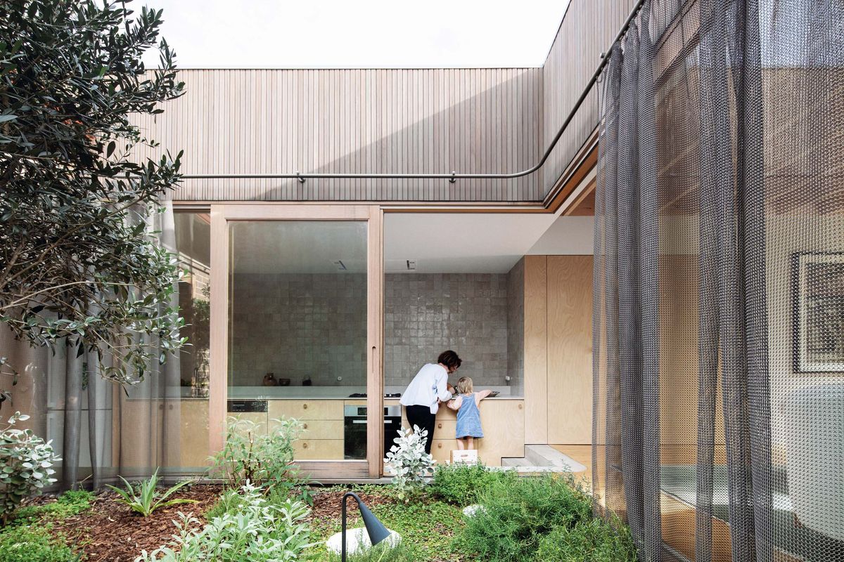
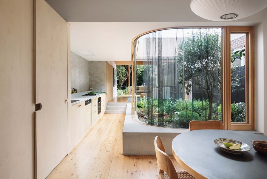
Working to an ethos of “less house, more garden,” Jemima and Mitchell removed the lean-to structures and one wall of the living room, then inserted a new enclosed garden into the space. Full-height glass panes, fixed and operable, define this garden’s edge, bringing the outdoors in.
“Gardens have always been important in my family,” explains Jemima. “They’re important in our work too, where we use them like a borrowed space, particularly on tight suburban sites, where every inch matters.”

Efficient and purposeful, the design has added just four square metres to the size of the house.
Image: Clinton Weaver
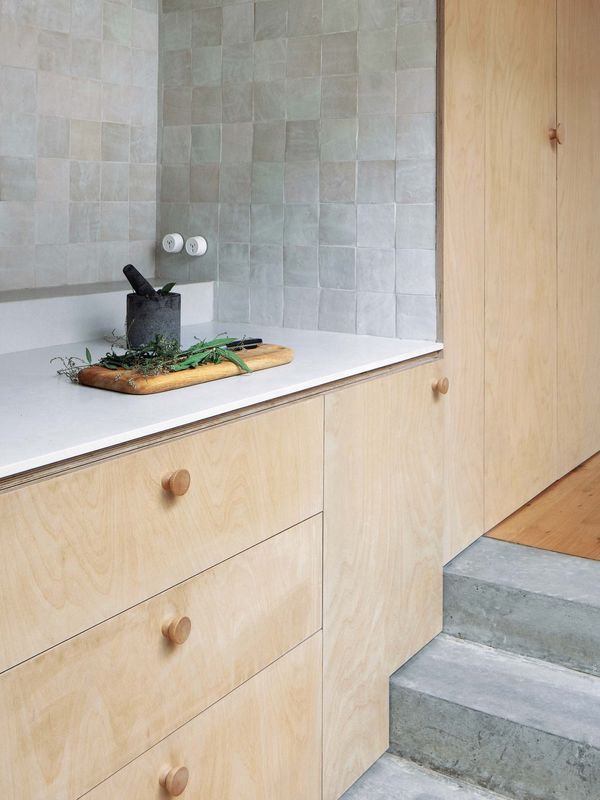
The old living room, which had not seen the light of day for a century, is now a dining room full of dappled light. The galley kitchen stitches it together with a cozy new living room, a few steps up. The steps were necessary to meet council’s flood regulations, but the height also creates a lovely ledge seat of formed concrete around the garden.
“We try not to do the sort of architecture that delivers that old house/new house break. Whatever the alteration, we want it to unify the house as a whole,” says Jemima.
In place of the old tin lean-to there now stands the central garden where a well-loved olive tree, potted for many years, is now finally liberated. At its feet is a ramble of silvery-green herbs and ornamentals, a landscape pocket designed by Studio Rewild’s Kirsty Kendall.
The original facade and front rooms of the house were refreshed, the timber floorboards and patterned ceilings revived. With removal of the lean-tos and addition of the living room, only four square metres internally have been added. A confident material palette featuring plywood for joinery and LVL beams has been scrupulously crafted, while the streamlined kitchen all but dissolves, allowing the elevated living room to gently hold court. This warm and private living room opens to two gardens and harvests light and sky views from its quaint clerestory window.
What makes it all sublime isn’t just the garden but an economy of materials and space with careful, quiet detailing. It’s a masterclass in doing more with less. So I ask Mitchell, “How much is enough space to live well?”

A calming palette of timber, white walls and hand-glazed tiles unifies the zones of the addition.
Image: Benjamin Hosking
“We don’t exactly think of it like that. Once the basic functional requirements are met, we tend to think that living well is not a question of scale, but amenity. So, we prefer to create an efficient and purposeful space that’s well resolved, because we can always use the architecture to borrow space beyond the boundary if needed.”
Along with retaining most of the original structure, every move the architects made in opening up to light and natural ventilation, using durable materials and few applied finishes, has reduced the carbon footprint and energy consumption going forward. And Bridget has the garden connections she was looking for, along with some she didn’t anticipate.
“There’s an hour or so in the later afternoon when daylight is fading and the garden lights come on – I really like moving around this space, observing the colours and light as I’m preparing dinner,” says Bridget. “I’m an insomniac, so I also love it around 4 or 5 am when there’s a full moon, bathing the space in silver light. It feels very special.”
Products and materials
- Roofing
- Zincalume Spandek
- External walls
- Silvertop ash tongue-and-groove shiplap cladding from Radial Timbers in Cutek CD50 Internal walls: Plasterboard in Dulux ‘White Exchange Half’ and ‘Snowy Mountains Half,’ and Porter’s Paints ‘Triple Newport Blue’ and ‘Moorhen’ Windows and doors: Curved glass and custom timber-framed windows in Victorian ash and blackbutt from Artarmon Joinery
- Flooring
- Cypress pine tongue-and-groove; custom colour Agra rug from Armadillo and co.
- Lighting
- Nelson Saucer pendant from Herman Miller
- Kitchen
- Pressed porcelain benchtop from Artedomus; birch plywood cabinetry; zellige tiles from Tiles of Ezra; Miele appliances; Falmec rangehood; Interia Stealth and Half-Moon handles in ‘Rock Maple’
- Bathroom
- Rogerseller tapware in ‘Brushed Nickel’; porcelain tiles from Di Lorenzo Tiles
- External elements
- Alphamesh stainless steel chainmail curtain from Augen Design
- Other
- Artek dining table; Tait Volley chairs and Tidal table
Credits
- Project
- House for a Garden by Retallack Thompson
- Architect
- Retallack Thompson
Sydney, NSW, Australia
- Project Team
- Mitchell Thompson, Jemima Retallack
- Consultants
-
Builder
Joseph McCombie Carpentry
Engineer Cantilever Consulting Engineers
Landscape architect Studio Rewild
- Aboriginal Nation
- House for a Garden is built on the land of the Gadigal and Wangal peoples of the Eora nation.
- Site Details
-
Location
Lilyfield,
Sydney,
NSW,
Australia
Site type Suburban
Site area 225 m2
Building area 83 m2
- Project Details
-
Status
Built
Completion date 2021
Design, documentation 6 months
Construction 6 months
Category Residential
Type Alts and adds
Source
Project
Published online: 4 Mar 2022
Words:
Peter Salhani
Images:
Benjamin Hosking,
Clinton Weaver,
Retallack Thompson
Issue
Houses, February 2022