Typically, we are not aware of the influence that buildings can have on us; we have a tendency to underestimate architecture by exaggerating its utility. We often think of buildings not as spaces in which human life takes shape but rather as sites for certain functions and activities. This is part of the reason why Stuart Vokes, director of Vokes and Peters, is reluctant to label rooms by their function, preferring instead to think of them as vessels marked by what we do in them. The new Milani Gallery by Vokes and Peters constructs a sequence of spaces that provides a careful interplay between the cosmopolitan attitude that is common in venues for the display of contemporary art and the local character of the place in which it has been generated and is received.
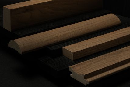
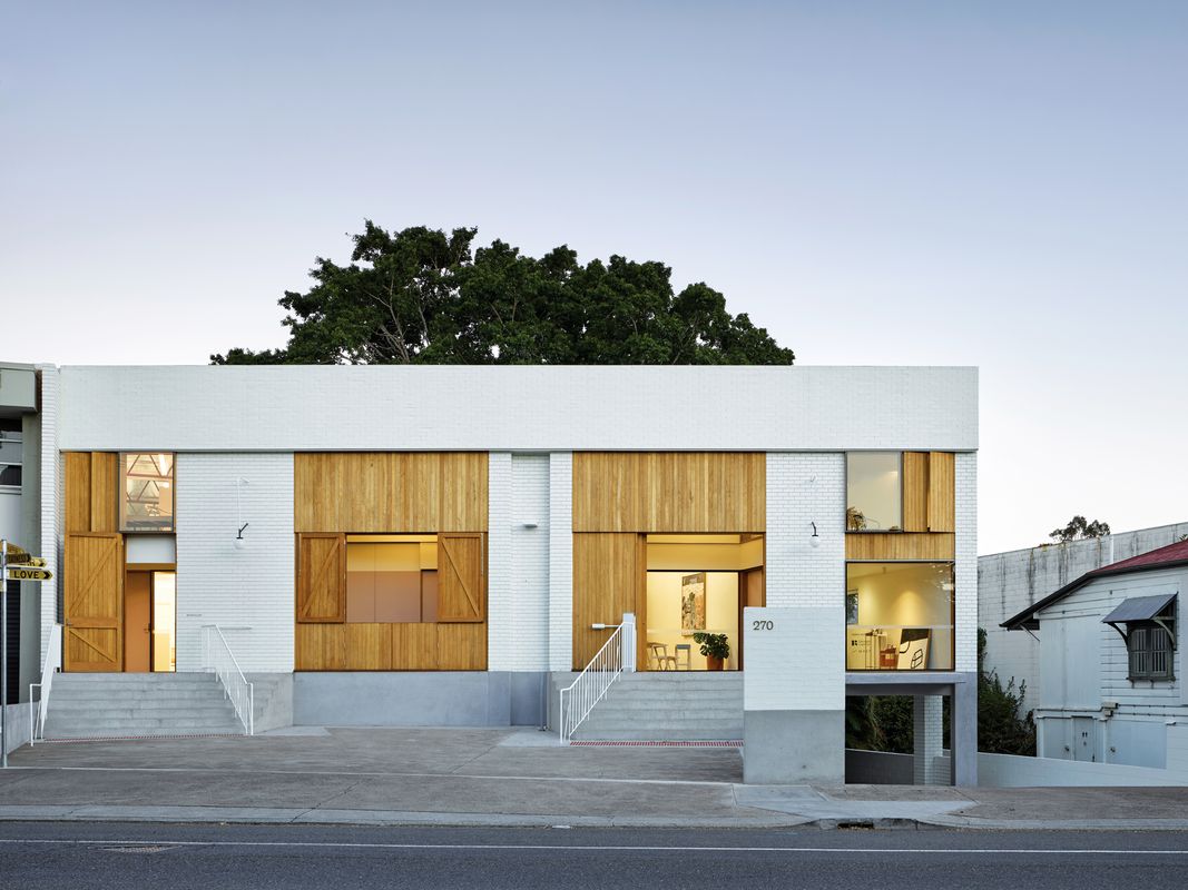
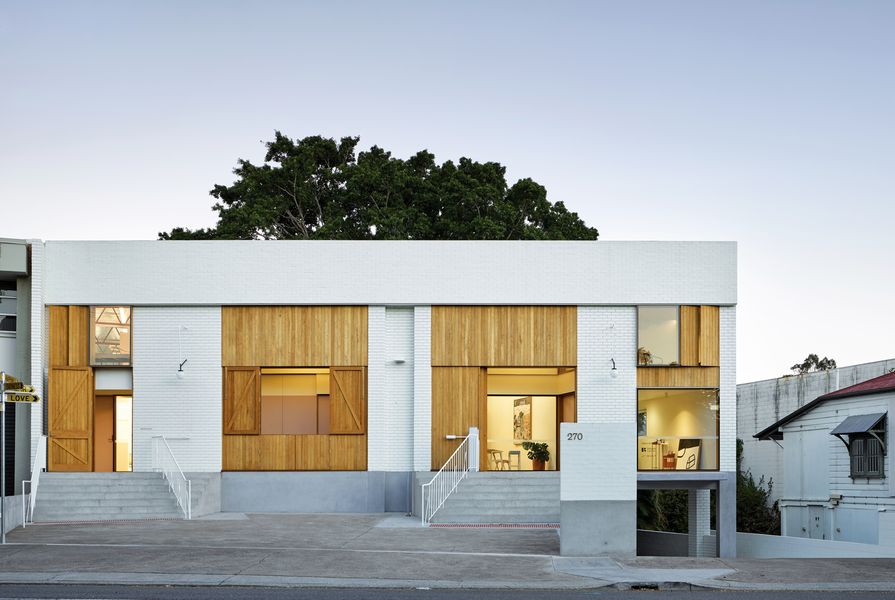
Milani Gallery, located among other recently refurbished warehouses in Brisbane’s West End, is one of three tenancies within a reworked industrial building that also includes a furniture showroom and Vokes and Peters’ own studio. The functional arrangement of the building has been determined by the existing warehouse structure. The entry to the basement carpark, goods loading area and elevated main floor level (set by the flood height of the nearby Brisbane River) dominate the building’s engagement with the street. Within this given structure, a series of carefully contrived moments and a reduced material palette of concrete, white-painted bricks and stained timber have been sparingly deployed. The construction method and detailing of these materials is prosaic and typical of most commercial building in Brisbane. However, the spatial play that comes from the recasting of utilitarian building techniques lends a civic quality to the reception and function of the building.
The redesign of the warehouse makes reference to – or shows reverence for – a number of historical architectural motifs exemplified by sixteenth-century Venetian architect Andrea Palladio: steps rising to an elevated piano nobile (principal building level), a portico providing outlook and protection from the sun, and openings within a symmetrical facade that are scaled proportionally to the hierarchy of activities within. These motifs are subtly expressed in modest contemporary forms. The manipulation of historical precedents and motifs within architecture is not an uncommon technique, but here the architects deploy these principles in such a beguiling way that they are almost hidden, appearing simply as pragmatic responses to the existing structure.

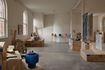
A spare materials palette and simple construction techniques ensure that the artworks remain pre- eminent in the space. Artworks: Rosslynd Piggott
Image: Christopher Frederick Jones
Flanking each side of the loading bay at the centre of the building’s street access are two broad stairs that rise to the podium level. Simply formed of mass concrete, the stairs’ conventional design is disrupted by the angling of handrails across the treads. This fairly minor gesture has the surprising effect of making the stairs feel flamboyant or extravagant (a very un-Brisbane sort of behaviour) by rendering a section not readily trafficable. By opening the throat of the stairs in this way, the architects have spatially reframed the forecourt as a plaza with the potential for public gatherings. Their positioning also discretely accommodates a small passenger lift to access the podium. Seemingly transgressing their functional use, the oversized stairs are reminiscent of decorative motifs by another Venetian architect, Carlo Scarpa. Scarpa’s use of stepping tessellated concrete ornamentation and stairs that extend their utility beyond the singular use of pedestrians changing levels has a resonance here.
At the top of the stairs, visitors pass through the large stained timber doors of the reworked facade into a semi-outdoor space. As a portico, this threshold enables entry to the three tenancies while also shielding the inner spaces from the western sun. Moving through this interstice and into the gallery entry, the space immediately compresses. Conceived as a library, the long and narrow entry room features a banquette and set of bookshelves on one side, a number of large paintings and a small office desk tucked away from view. It feels more like a waiting room, where you may feel obliged to announce yourself on arrival before weaving your way into the first of the galleries.
Each of the galleries increases incrementally in scale. The volume of the first gallery is commensurate with that of a private residence, while the second gallery is a larger cubic volume that allows for the presentation of artworks scaled to the proportions of contemporary art museums. Similar to the strategy employed externally, the material palette and construction techniques used inside are simple and economical. White-painted and square-set plasterboard walls, exposed roof trusses and the undersides of insulated roof panels evoke a utilitarian efficiency. The design is pared-back, seemingly getting out of the way of the reception of artworks. This is a quality that many gallerists and curators seek in the display of contemporary art and can often be a source of tension between clients and architects.
Here, Vokes and Peters deftly manages the desire for the white cube with the reward that comes from a unique viewing experience that is particular to a place. A small overhead skylight is sculptured and provides a curious link to the unseen activities of the rooms above. A welcome play of daylight is brought to the white surfaces. A 600-millimetre-wide full-height slit in one corner of the cube glances daylight across the main gallery wall. Visitors who are curious and bold enough to move through this narrow opening are rewarded by finding themselves in a discrete niche. Here a large window, not visible from within the gallery, provides an unexpected outlook to the leafy backyards of neighbouring houses. This view of jacaranda and mango trees, Hills Hoists and corrugated-iron roofs quickly draws visitors back to the subtropical context of Brisbane. It is in this quirk of a room that slightly more playful works are found, as if the intimate space permits artists to more readily confide in their audience. This place also provides visitors with a grounding in the locality in which they are viewing art, a move that is refreshingly at odds with the universal sensibility that the white cube seeks to invoke.

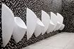
The gallery’s flexible rooms allow for a variety of uses while incorporating enough thoughtful detail and character to suggest ways of occupation. Artwork: Vernon Ah Kee.
Image: Christopher Frederick Jones
Above the entry is an enfilade of three rooms, accessed via a carefully managed timber stair. Labelled on the drawings as “salon,” these rooms serve as a neat illustration of the working methodology of Vokes and Peters. At one end of the suite is the gallery director’s desk, a modest yet beautiful piece of joinery that returns the corner as a banquette. A picture window provides an outlook to nearby Davies Park and, when sitting here, you have a sense that you have been invited into a privileged place. Here you can imagine meetings with visiting curators, post-opening celebratory drinks with artists or even a brief daytime snooze.
Two sets of large folding doors allow the remaining two rooms to be separated. A kitchenette at the other end of the mezzanine can accommodate working sessions and even dinner parties. The mezzanine is engagingly lit by the skylight observed from the gallery below, which also offers a sneaky view through to the gallery, and this skylight lends the mezzanine a welcome dynamism and avoids it feeling like a cramped dead end. The rooms are flexible and facilitate a variety of uses, without being void of cues for how they might be occupied. Details are carefully conceived without being fussy. Doors have large notches cut from them, allowing their swing to intersect with the steel trusses of the roof. There is a surprising satisfaction that comes from registering these pragmatic gestures that create their own ornamentation. It is a subtle deviation from the Arts and Crafts aesthetic that characterizes much of Vokes and Peters’ residential work, without being a departure.
This is a very clever refurbishment by a practice that masterfully looks to create opportunities rather than solve problems in its designs. It is a trait that, I think, was learnt from the great Donovan Hill, and one that allows for the transformative power that both architecture and art can provide to our daily activities.
Credits
- Project
- Milani Gallery and Studios
- Architect
- Vokes and Peters
- Consultants
-
Accessibility consultant
Wendy Lovelace
Certifier Building Certifiers Australia
Electrical engineer Gray Light
Energy efficiency consultants Annie Musch Energy Ratings
Geotechnical engineer Precise Geotechnical
Hydraulic engineer H Design
Mechanical engineer Interior Engineering
Project team Stuart Vokes, Aaron Peters, Nicholas Skepper, Marty Said, Dana Kittel, Emma Denman, Kieren Dolores
Structural engineer Westera Partners
Surveyor Landmark Consulting
- Aboriginal Nation
- Built on the land of the Jagera and Turrbal peoples
- Site Details
-
Location
Brisbane,
Qld,
Australia
Site type Urban
Building area 626 m2
- Project Details
-
Status
Built
Completion date 2018
Category Public / cultural
Type Culture / arts
Source
Project
Published online: 7 Dec 2020
Words:
Dirk Yates
Images:
Christopher Frederick Jones
Issue
Architecture Australia, July 2020