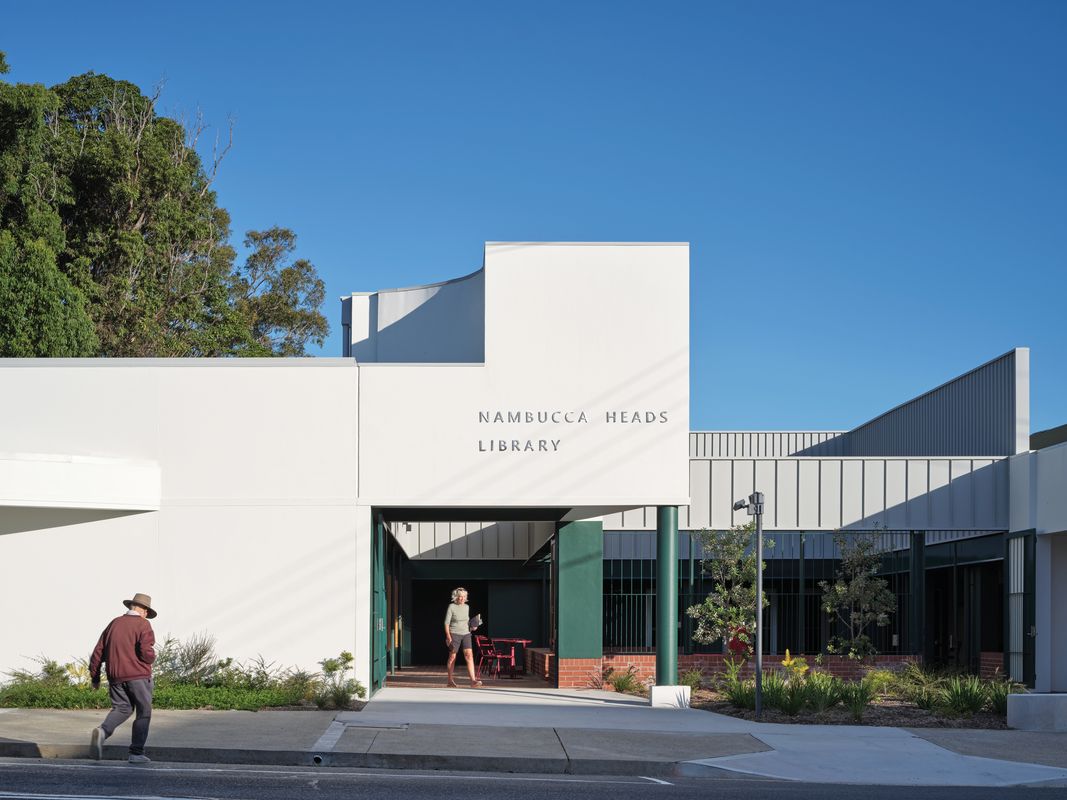
On the ridge of a hill in Nambucca Heads on the Mid North Coast of New South Wales is a post office, gallery, community hall and public library. The library has been recently renovated by Vokes and Peters with Zuzana and Nicholas.1 But the project is more than a renovation; it’s a consolidation that reorientates the existing buildings around a courtyard, adding a few accents – or serifs – in the process.
Serifs – the small strokes attached to the end of a larger stroke in typography – give extra definition to letters while also drawing the eye to the following letter in a word. This renovation adds three architectural serifs to three outboard corners. As in typography, these accents define the edge while drawing the eye beyond, transforming the building’s solidity into something more embellished.

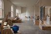
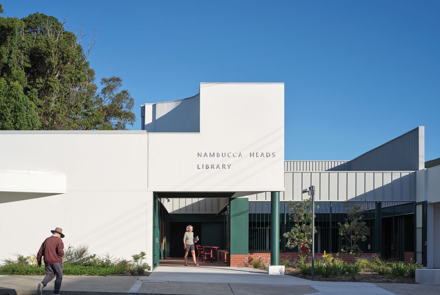
The public space at the front of the library is carefully composed to create a distinct – and welcoming – public form.
Image: Christopher Frederick Jones
On the northern corner, the library’s new entrance is marked by a portico that peels out into an acute angle. The white volume of the library extends out, ending in an elevated parapet that faces the street. Behind the parapet, a shaped relief of curves sits on a base of staggered bars. The combination is like the frieze and architrave of a classical portico. Apparently derived from the library’s former entry, only more intense, the expression is indulgent but tempered by its position, turned away from the street and subservient to the plain wall that bookends it. The portico relief is visible from a distance, while a solitary column marks the entry as you get closer. The entry portico draws you into a courtyard – an outdoor room – via a new, tall colonnade that feels appropriate for a public building.
“Public space” is a term often used, unconvincingly, to describe the area outside a building. In reality, the leftover territory between buildings rarely has a distinct spatial form. Alison and Peter Smithson preferred the term “charged void” to describe composed space between buildings.2 As long as the vertical dimension is proportional to the horizontal, you find yourself in a room, be it inside or out.
Tall parapet walls shape the new outdoor room at Nambucca Heads Library. Clad in sheet metal, the walls are divided into two panelled bands, with the panels in the upper band being twice as frequent as those in the lower band – like the cloister of Santa Maria della Pace. But, unlike a Renaissance cloister, this system has no apparent rational order. One band slides past the other, with the lower band separating the courtyard and the colonnade, and the upper band unifying the whole.

The courtyard is structured by sheet-metal walls, but characterized by comfortable “slippages, gaps and asymmetries.”
Image: Christopher Frederick Jones
The edge of the courtyard’s walls can be read from the street, revealing the artifice. Like a Potemkin village or a film set, the purpose is effect. These walls are not the structure of a building but the structure of a space. The sensibility is idiosyncratic: the spatial definition is assertive, but the system is never complete. It’s adjusted and accommodating. As a result, rather than an abstract place to look at, the courtyard is somewhere comfortable to be – somewhere you might meet a friend before a walk, somewhere to go when you need to get out of the house and the beach is too windy. Like the courtyards of French farmhouses, it has slippages, gaps and asymmetries.
On its southern corner, the library extends over a steep, forested slope. The facade lifts to meet the corner on one side, both dramatizing the end of the building and pulling your eye up to the canopy of trees foregrounding it. Inside the library, the ceiling raises to meet a clerestory window through which the full scale of the trees is evident. This serif makes the rear of the building feel more open-ended.
At the edge of a steep drop on the library’s eastern side, a public toilet reads as an assemblage of components: gates, chamfered columns, breeze blocks, a raked roof and a sheet-metal parapet. In contrast to the solid library wall, this space feels open – like an amenities block you might find at the beach. Although small, it’s articulated. Belonging more to the footpath, the car park and the forest, the ensemble makes an expressive end to the building.

Panoramic windows provide views of the rainforest to the rear of the library and give the building an open-ended feel.
Image: Christopher Frederick Jones
So, how to distil this project? Is it the architectural serifs that transform the existing library? Is it the reorientation of the building to face the courtyard? Or is it the courtyard itself, forming an urban figure in a beach town? There is no one concept, no singular form, no diagram, and no consistent expression. This project is not a one-liner – and that is its essential quality.
More than a building, Nambucca Heads Library is like a fragment of the city. Cities grow in layers of building and rebuilding over time, composed little by little from the work of many hands. Contradictions and ambiguities appear by chance. You won’t find perfection or coherence in most popular cities. This project grows from an existing structure, while proposing an altered direction. If the adjacent community hall gets renovated one day, it will have the chance to respond to this new situation. And in this way, the layering will continue.
And while it’s like a city, it’s also like a backyard extension with a lean-to, a deck and a garden. Home renovation is improvisation – opportunistic, compromised and ad hoc. From renovation, an ordinary house develops a particular character. Together, Vokes and Peters and Zuzana and Nicholas are cultivating a sensibility from their work on house alterations and additions, and carrying it into the public realm.
- This kind of collaboration between two smaller practices is not common. Normally, a small boutique practice might partner with a commercial practice to deliver the documentation. In this scenario, the collaboration is more of an ongoing conversation, with specific authorship difficult to discern.
- Alison and Peter Smithson, The Charged Void: Architecture (New York: Monacelli Press, 2001).
Credits
- Project
- Nambucca Heads Library Extension by Vokes and Peters with Zuzana and Nicholas
- Architect
- Vokes and Peters
- Project Team
- Aaron Peters, Nicholas Skepper, Stuart Vokes, Zuzana Kovar, Sam McQueeney, Gordon Macindoe, Gavin Chow
- Architect
- Zuzana and Nicholas Architects
Brisbane, Qld, Australia
- Consultants
-
Builder
O’Donnell and Hanlon
Building surveyor Acheson Building Certification
Fire engineer Anthony Hulbert
Landscape consultant Nambucca Valley Council
Mechanical, electrical and hydraulic engineer Lucid Consulting
Project manager NSW Public Works
Quantity surveyor Johnson and Cumming
Structural engineer Westera Partners
- Aboriginal Nation
- Gumbaynggir
- Site Details
- Project Details
-
Status
Built
Completion date 2022
Category Public / cultural
Type Libraries
Source
Project
Published online: 29 Jan 2024
Words:
Andrew Power
Images:
Christopher Frederick Jones
Issue
Architecture Australia, January 2024