No Vacancy Gallery is one of Melbourne’s most prominent “for-hire” galleries and a mainstay in the city’s contemporary art and design scene. First established in 2008, the independent gallery has offered countless young artists and creatives a platform on which to launch their careers and provided creative organizations an accessible CBD space for small- to mid-sized events.
Not long after COVID-19 lockdowns first struck the country in the first half of 2020, owners Matthew Naturani and Hayley Haynes saw an opportunity to grow the small cafe operating in the space (previously a purely takeaway affair) to diversify their business in the expectation that the arts would not suffer the pandemic well – and how right they were.
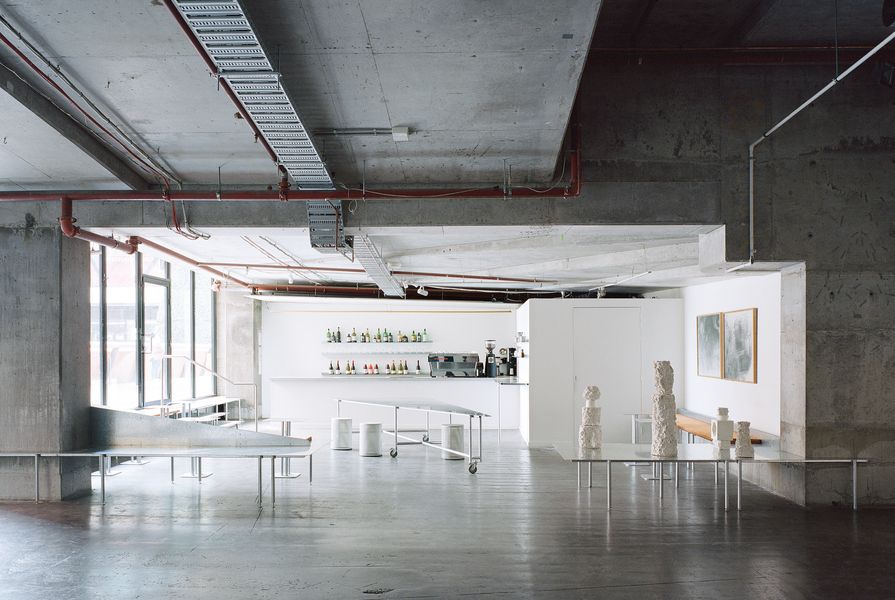
As much an exercise in subtraction as addition, the design by Ware Architects is so in tune with the space’s existing utilitarian character (think raw concrete and exposed services) that it appears to have always been there. Not only does it accommodate an expanded sit-down cafe in the space, but the floorplan also cleverly reconfigures the spatial and programmatic relationship between gallery and cafe, maximizing how each benefits the other.

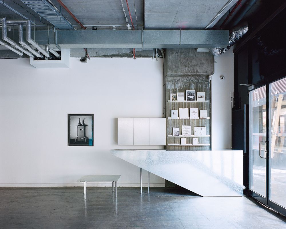
The concrete shell is unexpectedly organic, with the ceiling pinwheeling out in a stepped ramp formation from a central column.
Image: Rory Gardiner
The two main moves consisted of removing partition walls to make the space feel larger, enabling longer views across the gallery, and introducing a system of seating that balances comfort and amenity for cafe patrons, while remaining flexible and reconfigurable for shows and events. Other considerations included replacing the entry stair, supplying new cabinetry for the bar area, adding extra shelving, and designing a new entry-desk-slash-jewellery cabinet in the gallery space.
As is appropriate in any gallery fitout, the Ware Architects design serves the art on display and does not scream for attention. The minimal material palette is centred around galvanized steel sheeting (selected to mirror the material of the existing exposed airconditioning ducts), and simple, bold geometries are configured in ways that balance functionalism with moments of playfulness.
Two perimeter benches span opposite sides of the cafe zone, jutting out like peninsulas to mark a soft division between cafe and gallery with flat surfaces that can be used to display sculpture or other objects. One of these is dissected with a vertically positioned, triangular plate of galvanized steel that spans back to partially clad an existing concrete column, blurring the line between new and existing. Another fine detail with the same effect is where the steel perimeter benches horizontally wrap the concrete columns to terminate in the gallery zone proper. Client Matt tells me a few exhibitors have described this detail in unflattering terms, as it limits the display potential of the wall, but he loves it nonetheless.

Copper velvet upholstery gives small moments of material embellishment, providing basic comfort and relief from the intensity of the steel.
Image: Rory Gardiner
Burnt orange cushions are fixed to the benches and are the only use of colour in the design. They bring a very welcome sense of warmth to an otherwise cool palette.
In the centre of the cafe zone is a large communal table on castors; its shard-like form reflects the stepped ceiling above and acts to subconsciously point people toward the main gallery zone. This table, along with the rest of the steel furniture, is supported by legs that are sometimes singular and sometimes paired, with no apparent structural logic to why this is. According to Jonathan Ware, it’s to emphasize the sense of the surfaces floating over a delicate structure. It’s one of a few quiet embellishments that interrupt the overall functional aesthetic.
While budget ingenuity is evident everywhere, the stools demonstrate a stroke of value management genius. With the original spec threatening to blow the budget, Ware, Matt and Hayley found an inexpensive office bin (yes, a bin) that, when flipped upside down and fitted with a simple linoleum top, made a more than worthy replacement.
The degree to which architect and client have worked together to make a very tight budget work is impressive, with much of the construction able to be completed by the clients themselves and clever design decisions implemented to obviate any sense of this being a low-budget project.
Now more than six months from completion, the verdict is overwhelmingly positive. Matt tells me cafe patronage is up, events are running more smoothly, opening night crowds hang around longer and buy their drinks here rather than elsewhere, and more people are engaging with the art displayed in the gallery than before.
With Melbourne’s artistic and cultural vitality so diminished in the wake of the pandemic, it’s projects like this one that demonstrate the important role design is playing to reinvigorate culture and community in our cities.
Products and materials
- Walls and ceilings
- Refurbished plaster, painted in Dulux ‘Vivid White’.
- Furniture and fixed joinery
- Galvanized steel framing hot dipped at Valmont Coatings. Pre-galvanized steel plate supplied and laser cut by Ultimate Laser. Upholstery material is Victory in ‘Copper’ from Warwick Fabrics. Glass is Amber Tanami from Axess Glass.
- Other
- Wall artwork by Harry McAlpine and sculptures on plinths by Lana Erneste.
Credits
- Project
- No Vacancy Gallery & Cafe
- Design practice
- Ware Architects
NSW, Australia
- Project Team
- Jono Ware
- Consultants
-
Steel joinery fabrication & installation
Steele Scale
Upholstery Lee May
- Site Details
-
Location
Melbourne,
Vic,
Australia
Site type Urban
- Project Details
-
Status
Built
Design, documentation 3 months
Construction 3 months
Category Hospitality
Type Bars and cafes
Source
Project
Published online: 7 Feb 2023
Words:
Ricky Ray Ricardo
Images:
Rory Gardiner
Issue
Artichoke, September 2022