Wall junctions are detailed to express the walls as thin planes. Image: Marion Treasure
The slender form of the Amenities Building in its context. Image: Marion Treasure
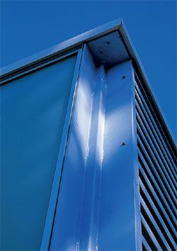
The bright blue steel column connects the walls in a playful negation of “corner”. Image: Marion Treasure
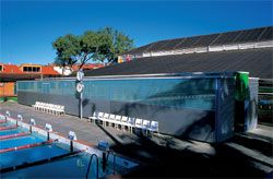
Looking over the 50-metre pool, with the new facility as backdrop. Image: Marion Treasure
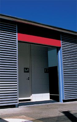
A moment of whimsy – the red “port” entrance. Image: Marion Treasure
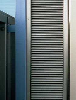
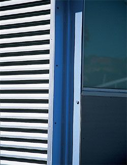
The louvres flanking the entry door, held off the external walls. Image: Marion Treasure
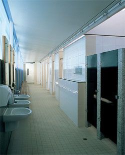
Interior view. Each element’s materiality is carefully explored and expressed. Image: Marion Treasure
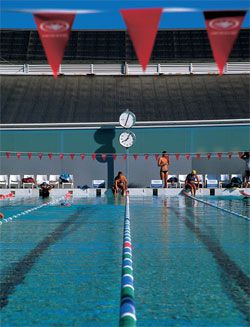
The Fremantle Leisure Centre, to be honest, is a mess. There is a cacophony of necessary but ill-considered sail shades over the three pools and grassed areas. The 1970s face brick municipal pool buildings have been unsuccessfully “updated” with rustic render, while the shed that covers the 25-metre pool is slowly corroding. Into this chaotic environment Bernard Seeber Architects have inserted a building of modesty and clarity, with what initially appears to be a mute elegance. It alludes to the future order of Seeber’s master plan for the centre as well as sitting as the backdrop to the main pools.
When I met the project architect Trent Woods on site, on a hot day in the middle of the school holidays, he modestly said that there wasn’t much to discuss. Fortunately, I disagree. In some senses, I want to talk around the project as much as I want to discuss the building itself. This is because the foreign and unfamiliar are made familiar through comparison to the known. And this modest pavilion is most definitely a foreign object, both in its immediate setting and in its broader architectural context.
Initially, the Amenities Facility reminded me of a small municipal pool designed by Quintans Raya Crespo in A Coruna in north-western Spain. It was not just the programmatic similarity and shared restrained architectural vocabulary that suggested the comparison. When the Galician project won a commendation in The Architectural Review ’s AR+D: Emerging Architecture Competition in 2002, the judge’s citation acknowledged its “gentleness and civic generosity”. It was this that sprang to mind when I first saw images of the Amenities Facility. The Spanish project is just one of many examples that demonstrate the remarkable Latin commitment to civilitas – the contribution that architecture can make to the public realm. The majority of these buildings are not the grande projects of the autocratic politician but are rather more modest in scale and execution. The municipal hall, the suburban library, the small auditorium and the post office all feature frequently, often in provincial locations. These projects all recognize the transformative possibilities of architecture. The same recognition of this potential drove the design of the Amenities Facility.
In pursuing this transformation, Seeber expounds what might be called a poetic pragmatism – an architecture that is generated by a rigorous interrogation of the brief and an equally systematic investigation of materiality. This results in an eloquently self-referential architecture. It is this pragmatism and the metre of the materials that set out the form of the pavilion. The caustic environment of the pool complex demanded that marine-grade aluminium be used for the exterior. The length of an easily lifted half sheet of cladding determines the location of the structural steel portal frames. The maximum area for safety glass orders the location of joints in the glazing, which is independent of the rhythm of the panels below. The glass is set out from one end, anodized aluminium panels from the other. The variation in the anodizing produces a subtle pattern on the elevation, while the louvred short sides of the building face the prevailing winds. The wedge evident in drawn elevations but imperceptible on site is the result of the minimum pitch and overlapping requirements of the roof and skylight sheeting.
In its material “thinness” the Amenities Facility recalls the resolutely planar and artificially thin Modernist buildings of Geoffrey Summerhayes, which reached their apotheosis in Summerhayes’ own house at The Coombe, Mosman Park (1961). The house is detailed so that it appears to have been constructed out of a series of insubstantial folded metal roof and a one-course concrete slab. Each surface is held off the others by a shadow line of a single course of black bricks or timber packing. The exaggerated negative detailing confirms the elements as individual planes held together in a taut assembly.
Unlike Summerhayes’ suppressed materiality, Seeber’s “thinness” is made possible through the exploitation of the constraints of the programme and an adroit selection of materials. There is no requirement for the insulated double skin. The walls sit off the ground, with a permanent “real” shadow line, to facilitate the pavilion’s passive ventilation. This also allows the expression of the thinness of the construction. The walls are separated by the bright blue steel column in a playful articulation of the negation of the corner. Other details contribute to this. The stainless steel downpipe is held off the wall. The compressed sheeting entry panel slides past the louvre panels that flank it. Disappointingly, the relationship between the roof and the building is less satisfying.
It has none of the lightness of touch of the walls to the ground or to each other.
The exploration of these independent surface relationships continues within the change rooms. The walls stop short of the ceiling. Here the disappointment of the external wall/roof relationship is countered by the soft luminescence of the strip skylight – a positive detail to counter the shadow’s negative? The black doors distinguish themselves from their terrazzo partitions. The mirrors slide off the granite splashback. They in turn are read as glass, substrate and frame. The white and off-white tiles, like Utzon’s two-tone chevron tiles on the sails of the Sydney Opera House, articulate what might have been a continuous surface and transform it into something else – a built shadow, a change in plane – as well as satisfying the disability code. Each element’s materiality as plate, slab, extrusion or sheet is expressed and investigated. This is not a resignation to decorated surface but rather an exploration of the possibilities of dealing with the planar. Like Sigurd Lewerentz’s constraint of using only whole bricks at his magnificent churches at Klippan and Björkhagen, Seeber has rejoiced in the material possibilities of this self-imposed limitation. Despite this conceptual rigour, there are also moments of whimsy in the execution of the project. The entrances are colour-coded red for port and green for starboard. The granite splashback is a moment of unexpected luxury in the utility of a public facility. The imperceptible rise in the roof is expressed more clearly inside on the light-washed ceiling.
Seeber maintains a strictly controlled tension between all the disparate parts of the facility. It is never pushed to the limits of fissure like a Howlett & Bailey open brick screen or the frayed monumental blockwork of Iwan Iwanoff. Instead, a sense of interweaving is articulated in the plan. While the tectonic articulation of the building elements is concerned with their separation, the zipper-like plan melds the programmatic and services components together. The “paired” male and female showers share the same plumbing and waste. The toilets interlock. Men and women enter from a shared entrance at each end.
The Amenities Facility prompts a range of associations that belie the normally silent associations of architectural minimalism. Like the insertion of a Donald Judd sculpture into the seemingly benign space of the museum, this elegant pavilion throws its immediate context into sharp contrast while drawing attention to its own understated complexity. Instead of remaining mute, it speaks eloquently of itself and the considerations of its architects. The care and attention given to such a modest commission give hope for a greater “civic generosity” in the design of the public realm in Perth.
Credits
- Project
- Fremantle Leisure Centre
- Architect
- Bernard Seeber
Fremantle, WA, Australia
- Project Team
- Bernard Seeber, Trent Woods, Frank Lindsay
- Consultants
-
Builder
KMC Constructions
Electrical engineer Concept Consultants Australia
Glazing Architectural Aluminium
Hydraulic engineer Hydraulics Design Australia
Structural engineer Scott Smalley Partnership
Tiles Original Ceramics
- Site Details
-
Location
Fremantle,
WA,
Australia
- Project Details
-
Status
Built
Type Public / civic
- Client
-
Client name
City of Fremantle
Source
Archive
Published online: 1 Mar 2005
Words:
Philip Goldswain
Issue
Architecture Australia, March 2005