A carefully modulated new building is knitted together with a group of mostly modest heritage structures. The context is the small campus of a TAFE in a regional Victorian city. The brief entailed the integration of a public library and the TAFE’s “learning hub.” Altogether, this sounds constrained though worthy. But despite the constraints – perhaps because of them – Kosloff Architecture has created a complex and interesting project.
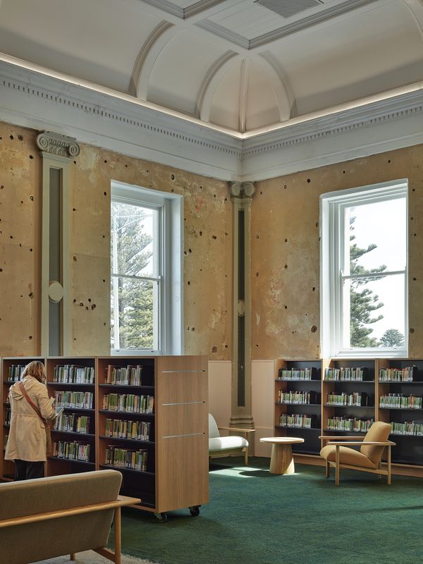
The main public street access to the library is through the classical pedimented front of what was an old hall with a history of various uses, including as a library. A smaller pediment supported by double columns on either side marks the doorway. It’s stripped back and spare, and now modestly wears its classical detailing behind a layer of off-white paint. Inside, the panelled, coved ceiling is also abstracted with white paint, but the walls have distressed remnants of the original decorative scheme with Ionic not-quite pilasters along the sides. This hall is spacious and sparely furnished with comfortable seating, shelves for large-print books, catalogue stations and the library help desk. Three large, hanging light fittings, each in the form of a cross, are the immediately obvious nod to newness and draw attention upward. To the north – housed behind much more modest facades – are an office for apprenticeship support and a quiet reading room with adjacent meeting spaces. In the reading room, the timber trusses of the old roof structure are exposed, and the new ceiling surfaces above are metal – white delineated with black lines, somewhat rehearsing the appearance of timber boards. Ceilings turn out to be a thing at the Warrnambool Library and Learning Centre.

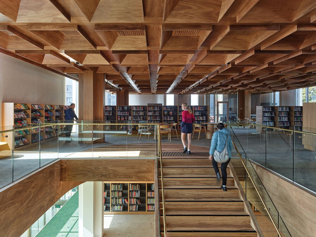
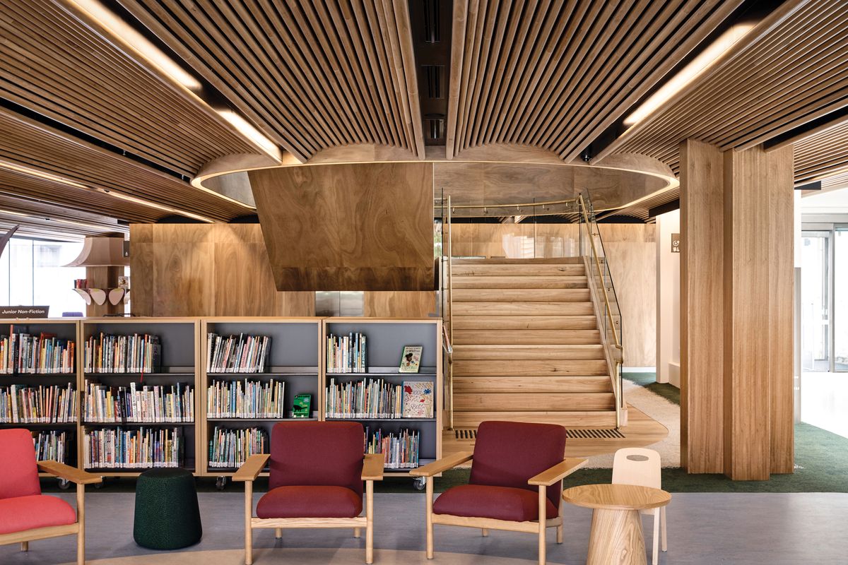
Timber is extensively used throughout the project, including in the ceilings, where services are carefully detailed to fit a vaulted design.
Image: Derek Swalwell
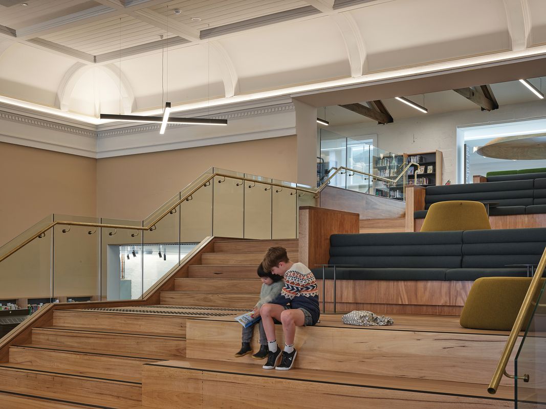
Back to the main hall. At the east end – where in some of the hall’s previous incarnations there was a stage – the new has taken over. The dominant feature here is a stack of stepped timber platforms (“study stage”), with a “grand stair” at one side in line with the centre axis of the hall space. The platforms stare back into the hall, a reverse audience. A large opening cut through the coved edge of the ceiling accommodates this stack and its stair, the incision emphasizing their newness. The stair takes us out of the hall and through the upper level of another old structure, with asymmetrical timber trusses supporting its roof (no fancy ceilings here), and then across a bridge over a top-glazed void into the main new building. Beneath this bridge at ground level, opening into the void and occupying adjacent found spaces, is a cafe. Other entries to the library, directly into the double-height void, are at either end.
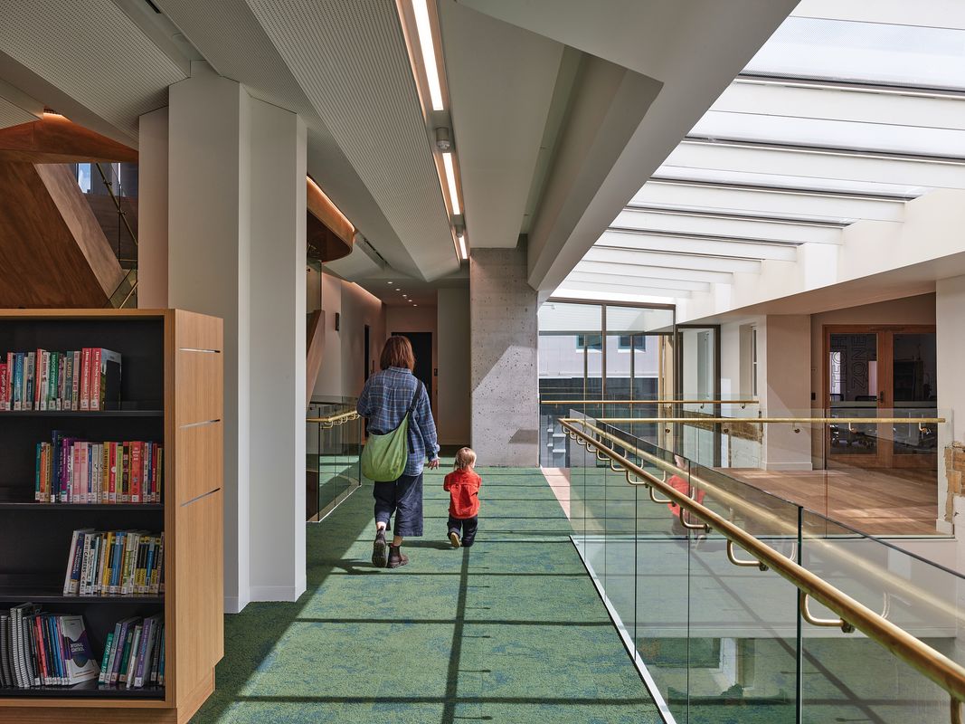
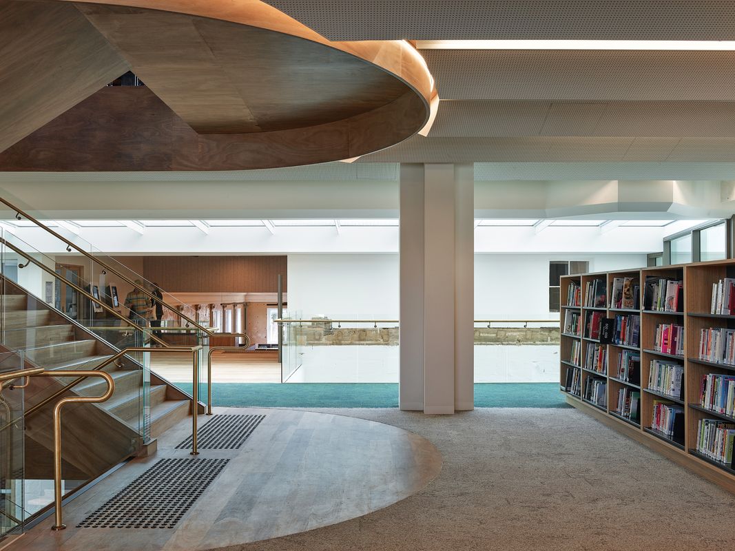
The new building has three levels. The ground floor is for children, with an area for groups and structured activities at the north, and for individual reading and play at the south. The surfaces here are predominantly timber: columns (cross-form in plan), ceilings and floors (where not carpeted) are all wood. Most of the ceiling is clad in hardwood timber rods arranged in sections to form shallow extruded vaults, with all the service necessaries (lights and so forth) detailed to fit. On level one – where the “feature stair” from the old hall had landed us, but which is also served by an open stair entirely within the new building – the range of finishes is different. While this second stair continues on its woody way, walls and ceiling are white. The ceiling here is folded white perforated surfaces, again organized in linear extrusions. This level has shelves for nonfiction. The periphery of the public space has desks, low tables and seating (both loose chairs and fixed seating in nooks created by the varied plan profile of the solid wall elements). This pattern is repeated on level two, which is devoted to fiction. But here, the timber cladding of the cross-form columns returns, and there is another complex ceiling design, this time of timber coffers, with the lighting and other services again beautifully integrated. On this level, a seating area at the south-east corner has views of Warrnambool’s coastline in the distance.

On the interior walls of the old hall, distressed remnants of the original decorative scheme have been retained.
Image: Derek Swalwell
I like the new building, as indeed I like the whole complex of new elements and old. The place is carefully detailed and spatially generous. The congeries works. But I do not understand why there are three such different ceiling treatments in the new, or why the timber finishes of the ground and second floors give way to white on the first. The architect’s reflected ceiling plans include an image of the ceiling of the old hall, solving the “where” of these ceiling designs but not the “why.” Other things that might have been used to differentiate the library ambience on the three levels according to their focus on children, nonfiction and fiction – such as carpets or furniture – are less distinct. I am puzzled by this. The building is a public facility worthy of a great deal of architectural care and a sense of calm, and these the design achieves magnificently. But why all that energy devoted to different ceiling treatments? Did the architects overdo it, expecting them to be value-managed out? The differences are distracting, as if there is some minor but continuous disturbance at the periphery of one’s vision. But maybe this only worries someone for whom architecture is foreground.
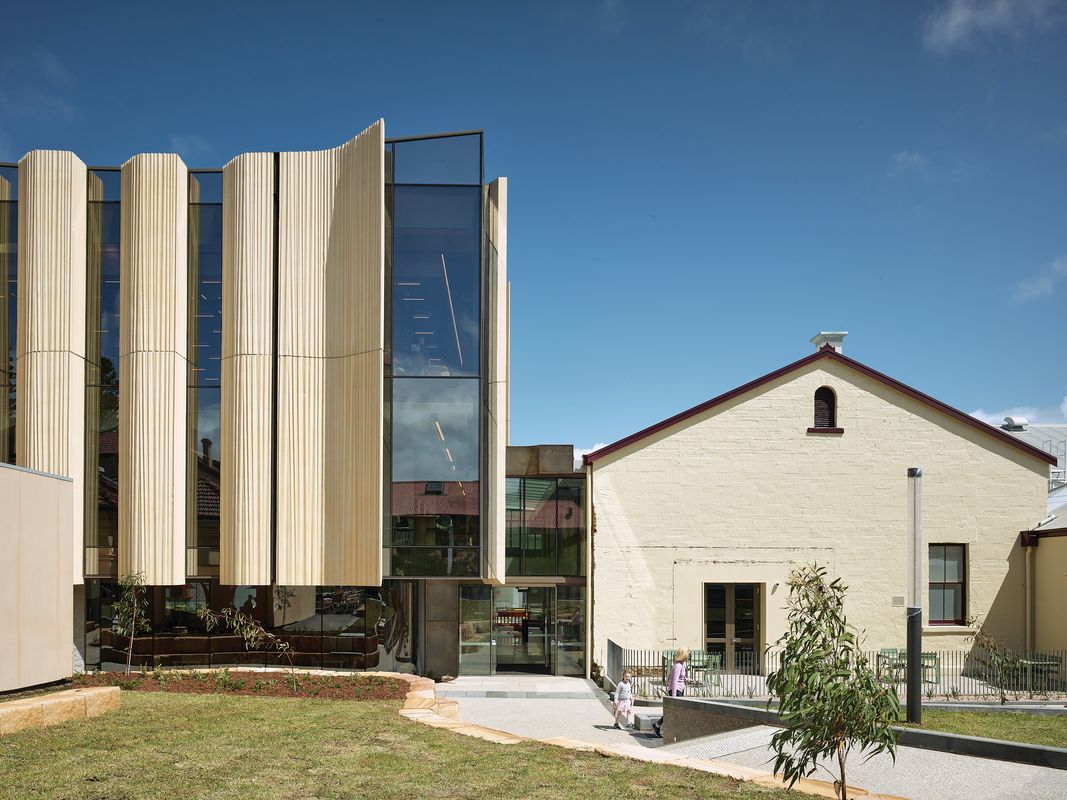
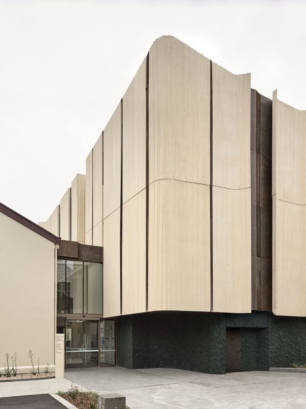
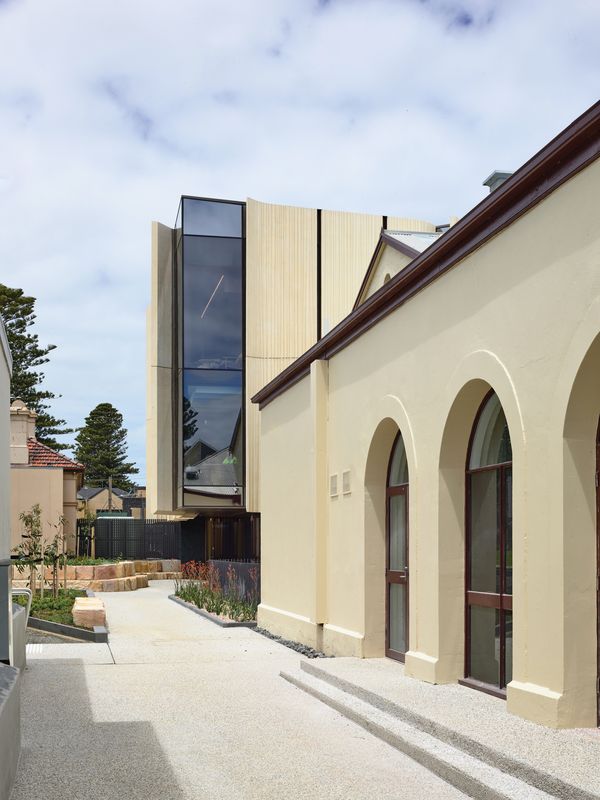
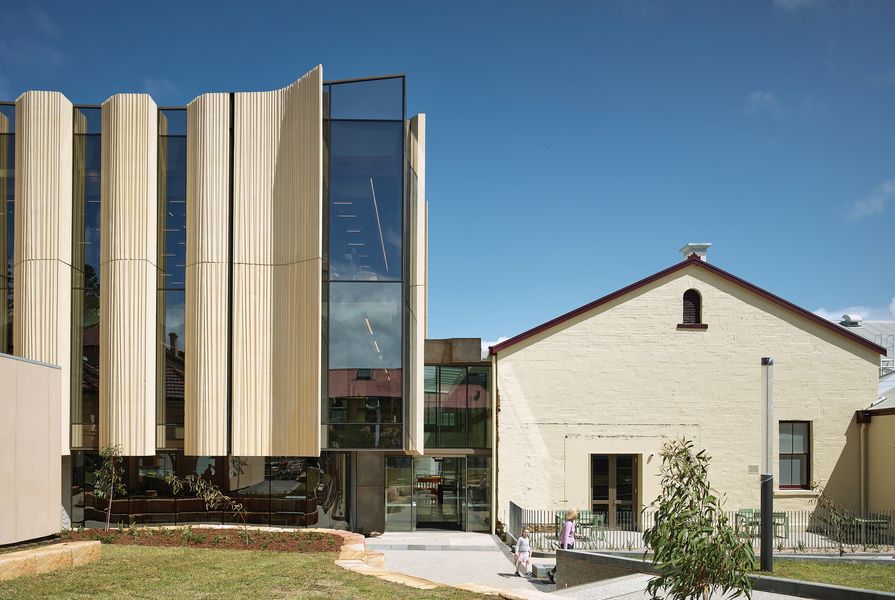
At ground level in the new building, the external walls to the north and east are entirely glazed, shaded by overhangs and allowing a view of the conserved historic customs house. To the south, the ground-floor walls are solid, corresponding to service areas in the building. Belying the internal differences, the exterior of the new building at its upper levels is a composition of vertical areas of glazing alternating with solid panels that span the floors, rising to a parapet subtly profiled upward toward the corners. The concrete cladding panels are cast with vertical impressions somewhat like gathered curtains, which flare out or fold in at their vertical edges, offering shade to the adjacent glass – skilful and visually rewarding. The new building has no street boundary, and perhaps the visually dominant vertical concrete panels and glazing were used to give the volume some visual presence and overcome the incoherence of its surroundings. This it does. To the south of the library site are service vehicle access ways; to the east, the stone customs house (domestic in scale); and to the north, a library forecourt, subtly landscaped into a series of spaces between the TAFE buildings.
Warrnambool’s Library and Learning Centre is a success, integrating old and new works without trying to “disappear” the new. If sometimes there is too much going on design-wise, this is a better, more generous fault than not enough. Moreover, there is a spaciousness about the place befitting a library’s dignity and making it a comfortable, humane environment. More places like this, please.
Credits
- Project
- Warrnambool Library and Learning Centre
- Architect
- Kosloff Architecture
Vic, Australia
- Aboriginal Nation
- Gunditjmara (Dhauwurd Wurrung)
- Site Details
- Project Details
-
Status
Built
Category Education, Public / cultural
Type Community centres, Libraries
Source
Project
Published online: 6 Jun 2023
Words:
Paul Walker
Images:
Derek Swalwell
Issue
Architecture Australia, May 2023