Steve Hunt Architect‘s interior design for Molten Store is a lesson in remaining uncompromising about brand identity when entering new territory. The Brisbane-based jewellery boutique has carved out a unique niche and name for itself through its ethical sourcing, recycling, restoring and crafting of high-grade sustainable pieces. A major requirement for the brand’s latest retail interior was to communicate these qualities within a shopping-centre context.
The brand started from humble beginnings as an online outlet and later expanded to include a standalone boutique on James Street. Recent growth has enabled the brand to open its second physical store at Chermside Westfield Shopping Centre, marking their transition from street-level retail to a department store.
The essence of Molten Store is in providing a personal, tailored service that is distinct from the typical retail encounter. Introducing the boutique into a shopping centre setting required deep consideration of the client’s brand identity and values. Steve Hunt, the project architect, said the client opted early in the design process to “lean into” and remain authentic to the defining features of the store, rather than to make sacrifices to assimilate with the new environment.

The architect, Steve Hunt, said the design approach involved striking a delicate balance between creating an intriguing atmosphere yet not deviating too far from the retail offering.
Image: Samuel Van Dyke – Kosk Photography
The interior layout was a critical component in distinguishing Molten Store from its competitors. “We did not want the layout to resemble a typical jewellery store where there is that distinct ‘us versus them’ dynamic with the server on one side of the counter and the customer on the other,” Hunt said, “we wanted the space to feel shared.”
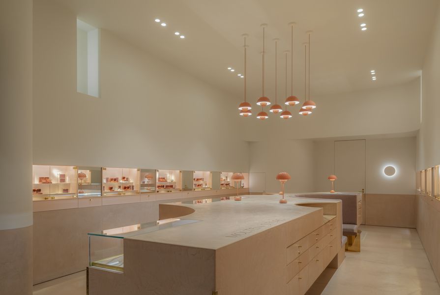
The aim of the floor plan was to create a “guided experience” where customers would be welcomed right away while also giving them the freedom to explore and browse items without having to ask for permission. A circular floor plan was integrated with a central island and a seating nook for personalized appointments. The looped plan enhances the flow of the store, ensures better accessibility for customers with trolleys or strollers and allows staff to visually monitor the activity without this feeling intrusive. The seating nook is cleverly tucked within the central island to offer clients privacy while they consider their purchases and discuss custom-made jewellery.

The wall units are illuminated so they stand out against their surroundings, directing the eye to focus on the product.
Image: Samuel Van Dyke – Kosk Photography
Products are predominantly displayed in raised cabinetry lining the walls of the store. Hunt explained that this tactic was strategically employed to position products at the customers’ eyeline. “Often in jewellery stores, you are looking down at the products, which are displayed beneath counters, but we wanted to elevate the products and make them more visible,” he said.
“One of the challenges of displaying jewellery is that often the pieces are only a few centimetres in size, making it difficult for people to visually engage with the product unless they are up close. For us, as the designer, it was about getting those products up toward the eyeline and grouping the products into smaller zones based on their specificity; for example, certain stones would be grouped together.” Hunt continues: “Considerable thought was also given to the lighting design, particularly in reference to the luminance contrast of the space. We illuminated and brightened the wall units so they would stand out against their surroundings, directing the eye to focus on the product display.”
Used throughout the volume, a subdued colour palette further accentuates the jewellery while also providing the ideal backdrop for seasonal merchandise rotations and decorations for festive periods.

The lower portion of the walls, floors and cabinetry were all finished in micro-cement to symbolize a “heavy element eroding over time.”
Image: Samuel Van Dyke – Kosk Photography
The narrative of mineral “erosion” was interwoven through the materiality of the store to reference the origins of the stones. Hunt explained that the lower portion of the walls, floors and cabinetry were all finished with a singular micro-cement material to symbolize a “heavy element eroding over time, while the white-painted upper volume of the fit-out serves as a more neutral, contrasting element,” he said.
“We envisioned the cabinetry as a heavy element that had eroded over time to reveal the jewels through the gentle erosion of a solid landscape. That was a loose concept that evolved throughout the design process.” Hunt explained that the vision was to envelop the products in lustrous materials. Layers of sturdy, heavy materials such as the micro-cement give way to shinier accents such as the polished Cappuccino Onyx benchtops and the brass and polished stone applied inside the drawer units.
Hunt said the design approach involved striking a delicate balance between creating an intriguing atmosphere yet not deviating too far from accepted retail aesthetics. The objective was to ensure that the space was clearly defined by its merchandise to prevent customers from getting distracted by the interior’s details.
The finished result is a design that breaks away from the repetitive nature of jewellery stores frequently found in shopping centre complexes, which Hunt described as being cluttered with “chaos product everywhere.” Instead, Molten Store achieves a quieter, more considered aesthetic. It is elegant and alluring yet easy to navigate.