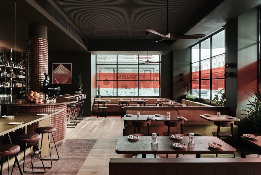
Studio Amaro is like a “warm hug,” said its designer, Wendy Bergman, of Bergman and Co. While the newly opened 100-seat venue in Melbourne’s Windsor does indeed radiate a friendly, cosy ambience, it also conjures feelings of nostalgia. Corduroy lounges, walnut finishes, dim lighting, orange window decals and chocolate-coloured tiles are reminiscent of an establishment born in the 70s.
The venue is the latest eatery to be delivered by restaurateur, the Commune Group, whose Melbourne-based restaurant portfolio includes the acclaimed Tokyo Tina in Windsor, Firebird in Prahran and Moonhouse in Balaclava. What sets Studio Amaro apart from its siblings is that it’s the first Italian restaurant developed by the group, who predominantly specialize in Asian fusion cuisine. The expanded direction provided Bergman and Co. with an opportunity to craft a new language and identity.
Despite being a fresh venture, Bergman explained there was a concerted effort to maintain continuity and character between each of the interiors. Unlike the previous venues that all embody the historical narratives of the buildings they occupy, Studio Amaro is housed within a contemporary site. “The challenge we faced was that our new building lacked the historical charm of the other buildings. We needed to incorporate some of that essence into the space to create the impression that it wasn’t new,” she said.
To achieve an aged appearance, the design team integrated warm timber details, accented with shades of orange, red, mustard and dark green – in what Bergman describes as “a nod to midcentury Italiano with a contemporary edge.”
“We wanted the ambience of the space to complement the food that was going to be served. The restaurant is casual and informal, and there was going to be a strong emphasis on pairing alcohol with food, so we needed to reflect those key functions and components,” she said.

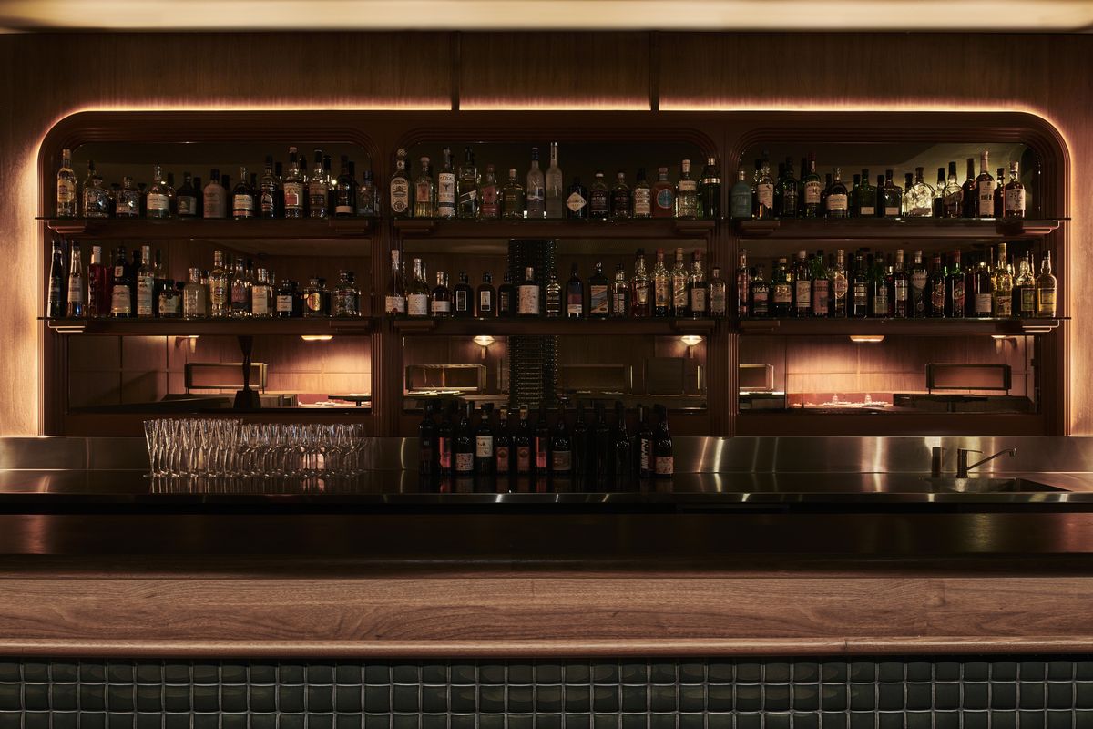
The bar serves as a partition, dividing the ground floor into two distinct sections.
Image: Tom Blachford
With the venue named after a type of liqueur, it’s no surprise that, upon entering the building, the first thing that catches your eye is a prominent mosaic-tiled bar crafted by Bergman’s husband, who is the founder of industrial design studio Please Please Please. The bar and its glazed shelving serves as a partition, dividing the ground floor into two distinct sections. Its transparency enables visibility from either zone, resulting in a sense of intimacy yet interconnectedness. Zones are also defined in the playful arrangement of timber flooring, which is oriented in different directions and patterns to delineate and break up the ground level.

Corduroy lounges, walnut finishes, dim lighting, orange window decals and chocolate-coloured tiles are reminiscent of an establishment born in the 70s.
Image: Tom Blachford
While the downstairs presents itself more as a relaxed lounge bar with food and drink offerings, the upstairs resembles a traditional restaurant setting. Consistency is maintained in the materiality of both levels, resulting in an uninterrupted flow. The colour palette differs slightly between floors, with downstairs slightly darker, moody and den-like.
“There is a lot of glazing upstairs, but we didn’t want it to feel like a fishbowl or that everyone was looking in on you, but we still wanted it to feel like you could sit comfortably in the space and watch the world. To create that feel, we integrated this fabulous orange decal that runs around the windows, which was a great way to just tone all that down, but it has an energetic visual aspect to it externally from the street and also from an internal aspect,” Bergman said.

One design method was to make every seat and corner of the venue as desirable as possible for different types of patrons, so that diners who come in for a sit down meal can identify spaces that they could return to for a different purpose.
Image: Tom Blachford
When designing an eatery, it is critical to get a comprehensive understanding of the kind of dining experience that the client intends to offer, whether it’s a quick bite to eat or a long sitting. In the case of Studio Amaro, Bergman said, the client outlined a desire to cater to both drop-ins and lingerers. “Accommodating different experiences was actually a difficult thing to achieve because as soon as people step in a venue, straightaway in their heads, subconsciously, they have decided how long they want to stay,” she said.
“Interior design has an affect on how long someone stays in a space either for a quick bite or a whole night experience. That decision comes from the lighting levels, the type of music that’s playing, the food, the staff and the aesthetics of the venue.”
Separating the interior into different zones was one method the practice used to cater for diverse user experiences. Another approach was to make every seat and corner of the venue as desirable as possible so that, for instance, patrons who come in for a sit-down meal can see the potential in returning for a quick drink. “We never want people who visit to feel like ‘Oh I sat there last time, bummer. That was the best spot.’ It’s really important to us that when you visit you feel like you’re sitting in a good space and that you’re enticed to come back again and have a different experience in a different area.”

While the downstairs presents itself more as a relaxed lounge bar with food and drink offerings, the upstairs resembles a traditional restaurant setting.
Image: Tom Blachford
As to the challenging aspects of the project, Bergman mentioned that the building’s acoustics, existing columns and the requirement for service fitouts posed issues. To prevent sound from bouncing off the glass and high ceilings, the design team integrated perforated ceiling plasterboard to absorb noise. They applied dark tiles on the columns to create the impression that the pillars were a design feature rather than a functional element. When installing services in the ceiling space they didn’t want to compromise the ceiling height, so they strategically placed bulkheads in certain areas, enabling them to raise the ceiling in other areas such as over seating.
Despite these obstacles, Bergman and Co. have managed to deliver a space that feels related to the group’s other venues, yet also distinct from them. The result is a pleasant and inviting atmosphere, capable of comfortably hosting diverse user groups with different motivations.